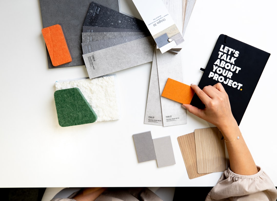
Fabric & Upholstery
Fabric Colour Trends in Interior Design
Fabric colour trends influence every layer of interior design, from the curtains framing your windows to the upholstery on your dining chairs and the cushions arranged on your sofa. Colour is the fastest way to update a space, and fabric — because it is relatively easy and affordable to replace — is where most homeowners, designers, and hospitality operators experiment with new palettes first.
This guide examines the fabric colour directions shaping interiors right now, with a focus on how these trends translate into practical choices for homes and commercial spaces in Singapore.
The Shift Toward Warm, Grounded Palettes
After years dominated by cool greys and stark whites, interior fabric palettes have shifted decisively toward warmth. Earthy tones — terracotta, ochre, warm camel, sienna, and clay — are appearing across upholstery, drapery, and decorative textiles.
This shift reflects a broader desire for interiors that feel nurturing and grounded rather than clinical. In Singapore, where many HDB flats and condos feature neutral white walls and light-toned flooring, warm fabric tones add personality and cosiness without the commitment of repainting or reflooring.
Terracotta, in particular, has emerged as a defining colour of the current design cycle. It pairs naturally with Singapore’s tropical light, which tends toward warm tones, and complements both timber furniture and greenery — two elements common in local interiors.
Nature-Inspired Greens Continue to Rise
Green in all its variations has been gaining momentum for several years, and the trend shows no signs of slowing. From deep forest greens to soft sage and muted olive, green fabrics bring the calming influence of nature indoors.
In Singapore’s garden city context, green fabrics feel particularly appropriate. They echo the lush tropical vegetation visible from most windows and create a sense of connection to the outdoor environment. Sage green — a soft, grey-tinged green — is the most versatile shade, working equally well in contemporary, Scandinavian, and tropical interior styles.
For upholstery, deep greens add richness and sophistication. A forest green velvet sofa or armchair becomes an instant focal point in a neutral room. For curtains and lighter applications, sage and olive tones provide a gentle, calming presence that supports relaxation.
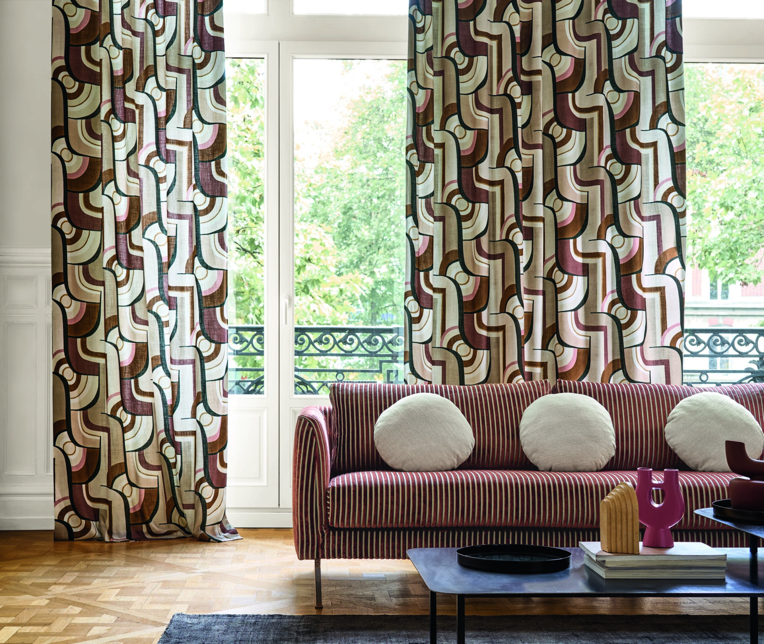
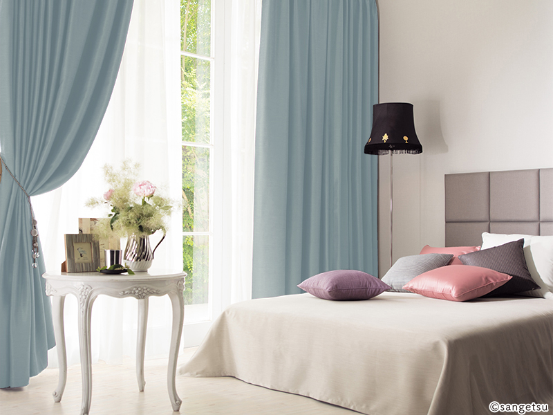
Rich Blues for Depth and Drama
Blue remains a perennial favourite in interior fabrics, but the current trend favours deeper, more complex shades over the bright blues and navy tones that have dominated in recent years. Teal, petrol blue, ink blue, and dusty blue are the standout shades appearing in fabric collections.
These complex blues work particularly well in Singapore’s well-lit interiors, where strong natural light brings out their richness without making them appear dark or oppressive. A pair of deep teal curtains in a living room with good daylight creates a sense of depth and luxury that lighter blues cannot achieve.
Blue also pairs exceptionally well with the warm earthy tones dominating the current palette — a terracotta cushion against a teal sofa, for instance, creates a colour combination that feels both contemporary and timeless.
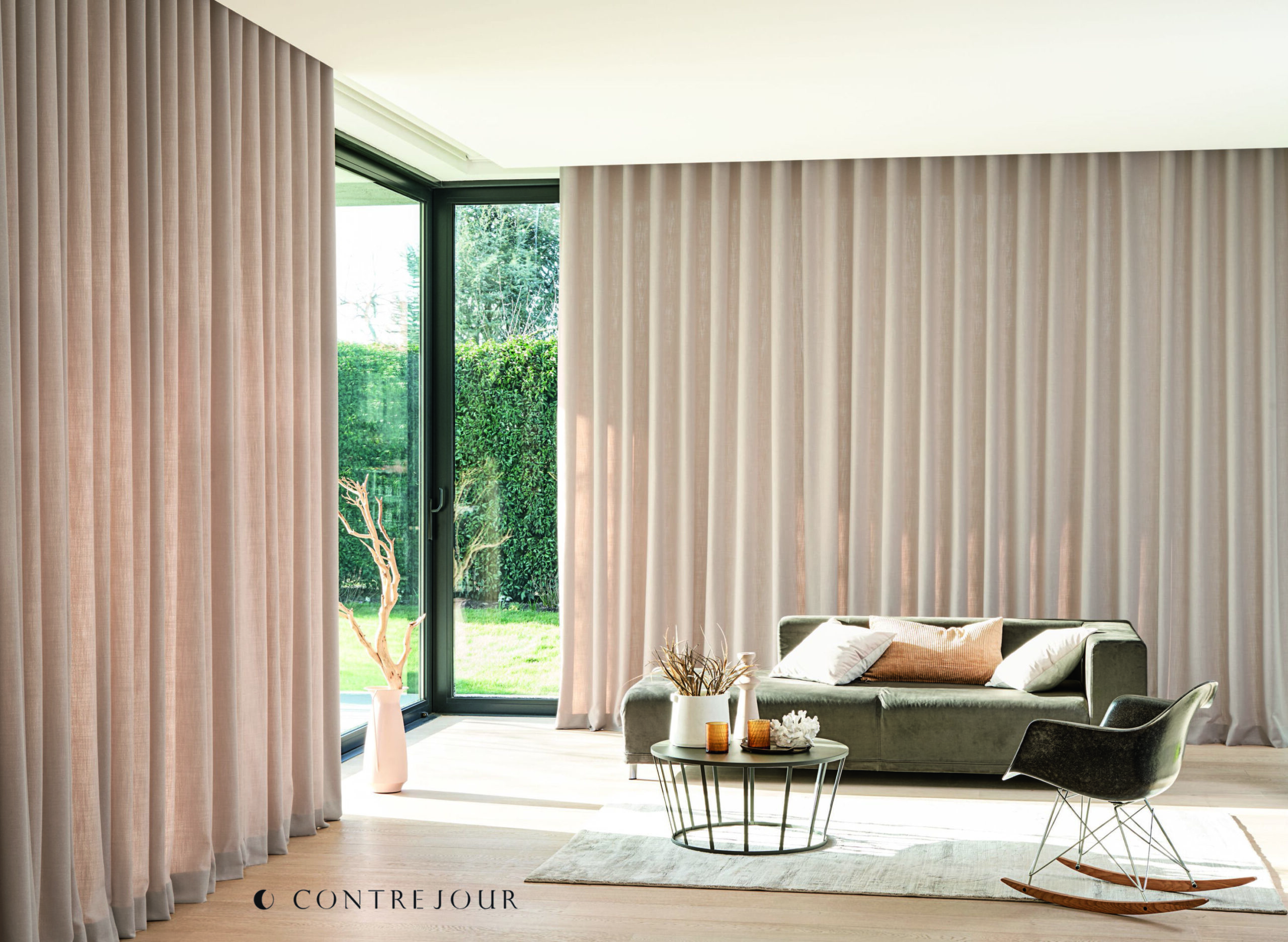
The Return of Warm Neutrals
Neutrals never truly go out of fashion, but their temperature shifts over time. The cool greys that defined the past decade have given way to warmer alternatives — greige (grey-beige), warm taupe, oat, and cream. These tones create a softer, more inviting foundation that complements rather than competes with bolder accent colours.
For large upholstery pieces — sofas, sectionals, dining chairs — warm neutrals remain the practical choice for most Singapore homeowners. They provide flexibility to update the room’s colour story through accessories, cushions, and curtains without replacing the major furniture pieces.
The warmth of these new neutrals is key. Where cool grey could feel stark in a minimally furnished room, warm taupe or cream adds a sense of comfort and lived-in quality that makes spaces feel welcoming even before accessories are added.
Colour Trends by Application
Different fabric applications call for different colour strategies. Here is how current trends map to specific uses.
| Application | Trending Colours | Approach |
|---|---|---|
| Sofa upholstery | Warm neutrals, deep green, camel | Choose a versatile base that allows accent changes |
| Dining chair upholstery | Terracotta, olive, dusty blue | Opportunity for bolder colour — smaller commitment |
| Curtains / Drapery | Sage green, warm taupe, teal | Sets the room’s colour temperature |
| Cushions and throws | Ochre, rust, plum, mustard | Easiest way to introduce trend colours seasonally |
| Bedding | Cream, blush, soft grey-green | Calming tones that support restful sleep |
How to Apply Colour Trends Without Regret
Following colour trends does not mean replacing your entire soft furnishing scheme every season. A strategic approach allows you to stay current while protecting your investment in quality pieces.
The 60-30-10 Rule
A classic interior design formula: 60 percent of your fabric colour scheme should be a dominant neutral, 30 percent a secondary colour, and 10 percent an accent. When trends shift, you only need to update the 10 percent accent — typically cushions, throws, and small accessories — to refresh the room’s appearance.
Invest in Neutral, Accessorise in Trend
Major upholstery pieces like sofas and curtains should be in colours you expect to love for five to ten years. Use cushions, table runners, and smaller textile pieces to introduce trending colours that may evolve over shorter cycles.
Consider Your Space’s Fixed Elements
Before choosing fabric colours, assess the fixed elements in your room — flooring, wall colour, kitchen cabinetry, bathroom tiles. These are expensive and disruptive to change, so your fabric choices must work with them. Singapore’s predominant light-toned flooring (white marble, light timber-look vinyl) provides a neutral base that accommodates most colour palettes.
Test in Situ
Fabric colours look different under showroom lighting, natural daylight, and evening artificial light. Always evaluate fabric samples in your actual space, at different times of day, before committing. Singapore’s natural light is warm and bright — colours will appear more saturated and slightly warmer than under the cool fluorescent lighting of many showrooms.
Colour Trends in Commercial Interiors
Commercial spaces — hotels, restaurants, offices, and healthcare facilities — follow colour trends on a different timeline and with different priorities than residential interiors.
Hospitality settings are embracing warm, earthy palettes that create a sense of home-like comfort. Hotels in Singapore are moving away from the cool, corporate aesthetic toward warmer schemes that encourage guests to relax and linger.
Office environments are incorporating colour to boost morale and brand identity. Break rooms and collaborative spaces are seeing bolder fabric choices — vibrant cushions on bench seating, coloured upholstery on lounge chairs — while workstation areas remain neutral.
Healthcare facilities increasingly recognise the psychological impact of colour. Calming greens and blues in patient areas, warm neutrals in waiting rooms, and gentle earth tones in aged care facilities all use colour therapeutically. Goodrich Global’s upholstery fabric collection includes commercial-grade options across the full spectrum of current colour trends.
Final Thoughts
Fabric colour trends offer a roadmap for keeping your interiors fresh and contemporary, but the best colour choices are ultimately personal. Use trends as inspiration rather than instruction — selecting colours that resonate with your lifestyle, your space, and the atmosphere you want to create.
The beauty of fabric is its flexibility. Unlike fixed finishes, fabric can be updated, swapped, and refreshed as your taste and the design landscape evolve.
Browse our e-catalogue for the latest designs and discover fabrics in the colours defining today’s interiors.