Interior Design
Colour Psychology in Interior Design: A Practical Guide
Colour psychology in interior design is the study of how different hues influence human emotions, behaviour, and perception of space. For architects, interior designers, and homeowners in Singapore, understanding these principles can transform a room from merely attractive to genuinely functional.
This guide breaks down the psychological effects of key colour families and offers practical advice for applying them across residential and commercial projects.
How Colour Affects Mood and Behaviour
Research in environmental psychology consistently shows that colour influences how people feel in a space. Warm tones like red, orange, and yellow tend to energise and stimulate, while cool tones such as blue, green, and violet promote calm and focus.
These responses are not purely cultural — many are rooted in physiological reactions. Blue light, for example, has been shown to lower heart rate and blood pressure, which is why blue is so frequently associated with relaxation. Red, conversely, can increase alertness and appetite, making it a popular choice in dining environments.
In interior design, these effects play out through wall colours, flooring tones, fabric choices, and the overall palette of a space. The key is matching the psychological effect of a colour to the intended function of the room.
Warm Colours: Energy, Appetite, and Warmth
Red and Burgundy
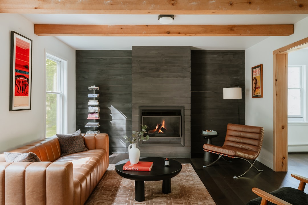
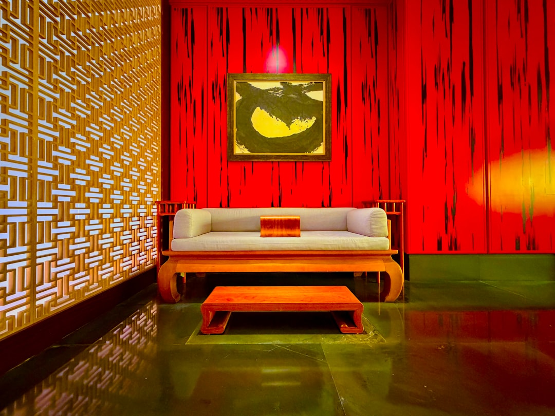
Red is one of the most powerful colours in interior design. It raises energy levels, stimulates conversation, and increases appetite. In Singapore homes, deep reds and burgundy work well as accent colours in dining rooms and entertainment areas. However, red can feel overwhelming when used on all four walls — a single feature wall or upholstered accent chair is often sufficient.
In commercial settings, red accents in restaurant interiors can encourage diners to linger and order more. It is also effective in retail spaces where urgency and excitement benefit the customer experience.
Orange and Terracotta
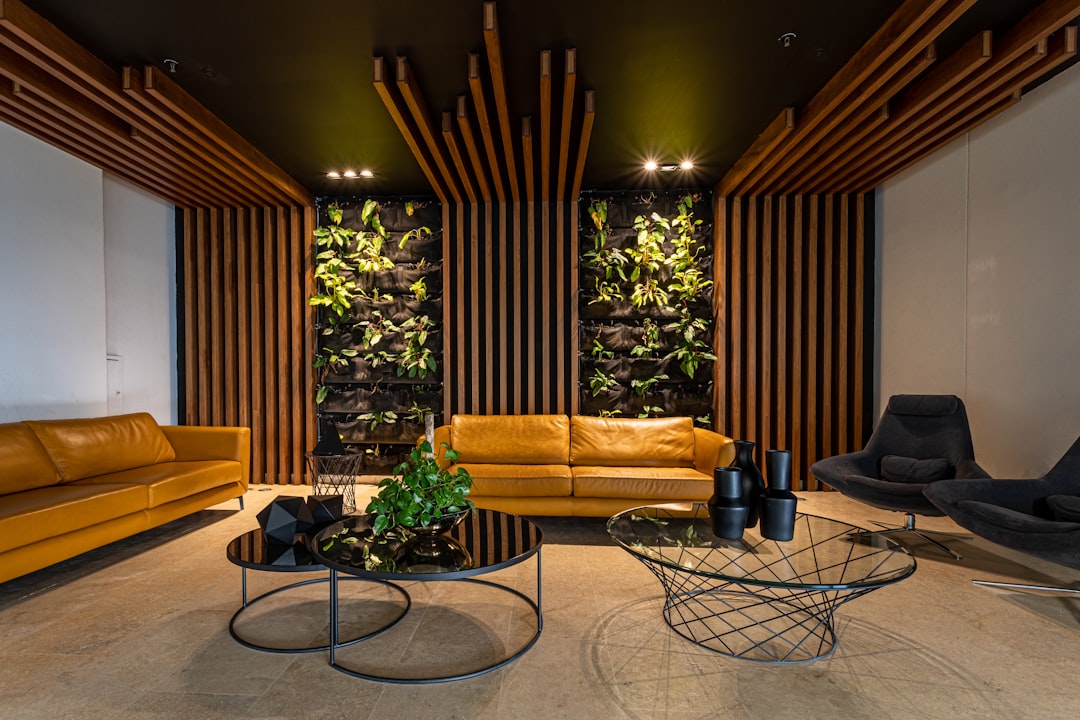
Orange blends the energy of red with the cheerfulness of yellow. Terracotta tones, in particular, have seen a resurgence in Singapore interiors. They pair beautifully with natural materials and tropical design elements. Orange is well-suited to social spaces — living rooms, kitchens, and communal areas.
Yellow and Gold
Yellow promotes optimism and creativity. Soft, muted yellows work well in study rooms and children’s bedrooms, while bolder gold tones can add sophistication to formal spaces. Be cautious with bright yellows in large quantities — they can cause visual fatigue over time.
Cool Colours: Calm, Focus, and Spaciousness
Blue
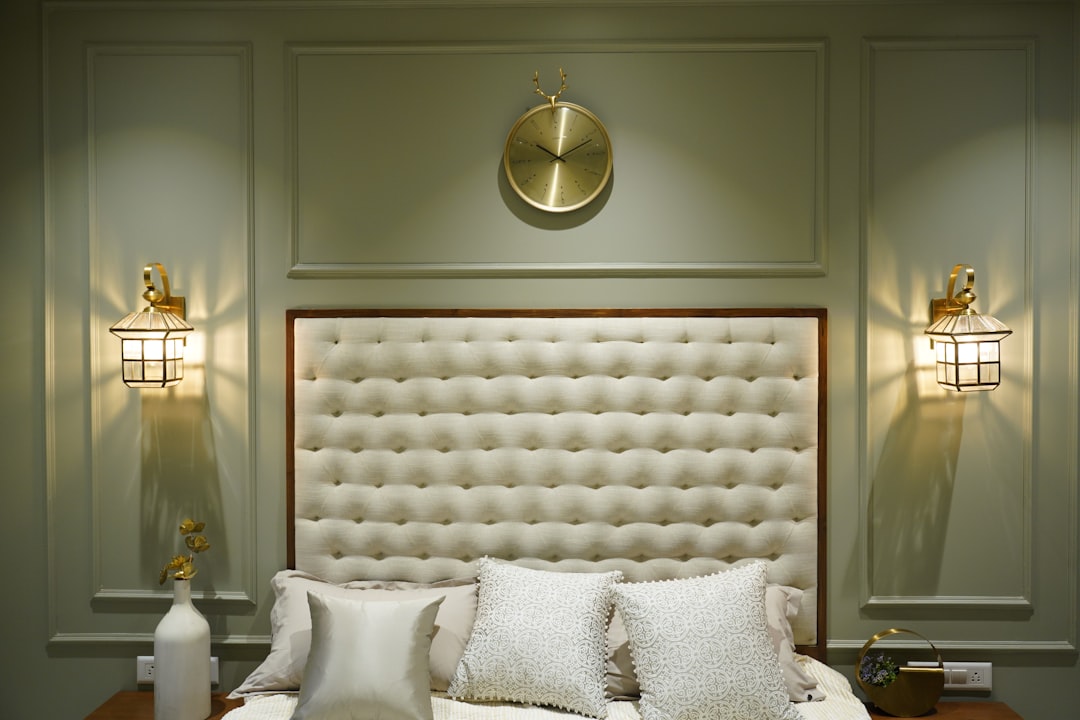
Blue is the most universally calming colour. Lighter shades make rooms feel more spacious — a valuable quality in compact HDB flats and BTO units. Deeper blues, such as navy, add drama and sophistication to bedrooms and study rooms.
Blue is also an excellent choice for office environments where concentration and productivity are priorities. Wallcoverings in blue tones can establish a calm, professional atmosphere without feeling cold.
Green
Green occupies the centre of the visible spectrum, making it the easiest colour for the eye to process. It promotes balance and reduces stress, which is why it works so well in bedrooms, living rooms, and healthcare environments.
In Singapore, green also carries associations with nature and the tropical landscape. Sage, olive, and forest green tones are particularly popular for residential projects, while muted greens suit commercial wellness spaces.
Violet and Lavender
Violet combines the calm of blue with subtle warmth. Lighter lavender tones are ideal for bedrooms and relaxation areas, while deeper purples can add a sense of luxury to formal spaces. Violet is best used as an accent rather than a dominant colour.
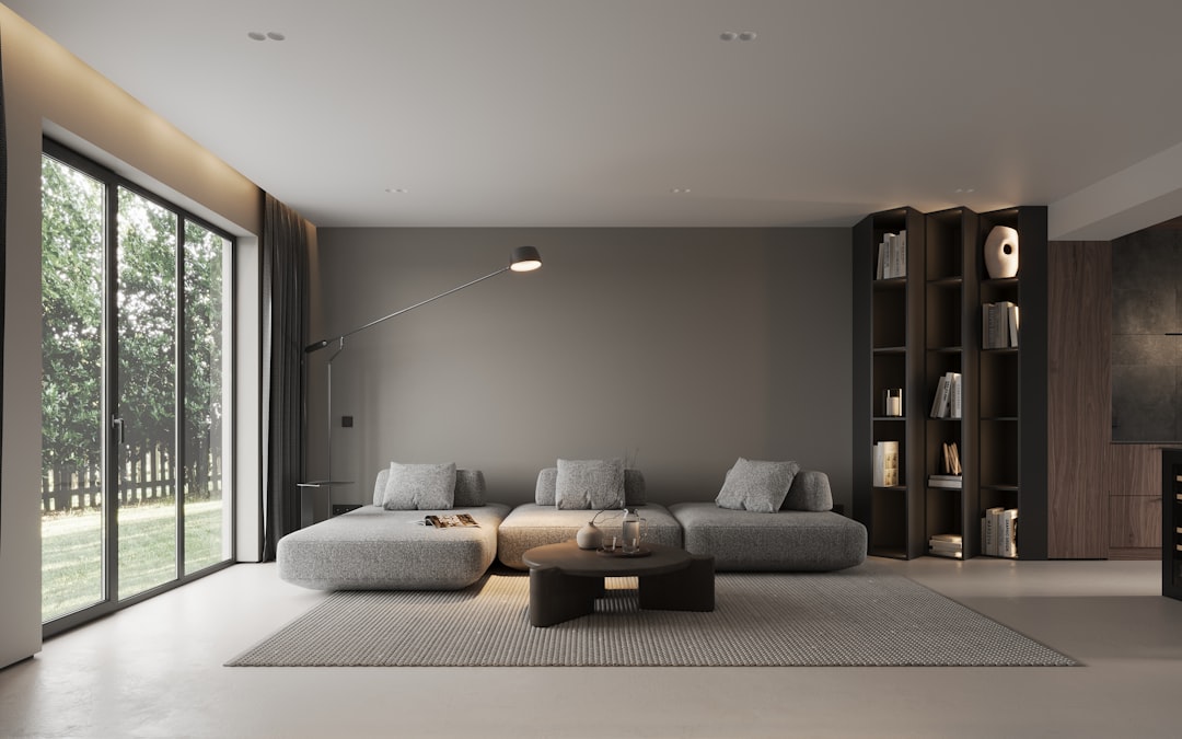
Neutral Colours: Versatility and Timelessness
Neutrals form the backbone of most interior colour schemes in Singapore. White, grey, beige, and taupe allow flexibility in furnishing and accessorising while ensuring longevity.
- White and off-white: Create an impression of cleanliness and space. Essential in smaller Singapore homes where maximising perceived room size is a priority.
- Grey: Conveys sophistication and modernity. Works well in contemporary condos and commercial spaces. Pair with warm accents to prevent a clinical feel.
- Beige and taupe: Warm neutrals that feel inviting without competing with furnishings. Popular in landed properties and hotel interiors.
- Black: Used sparingly, black adds definition and contrast. Effective in furniture, trim, and accessories rather than wall colours.
Neutral walls combined with colourful upholstery fabrics and textured wallcoverings offer the best of both worlds — a timeless base with personality.
Applying Colour Psychology Room by Room
| Room | Recommended Colours | Psychological Effect |
|---|---|---|
| Living room | Warm neutrals, soft greens, terracotta accents | Social, welcoming, relaxed |
| Bedroom | Blue, lavender, soft grey | Calm, restful, conducive to sleep |
| Study room | Blue, muted yellow, green | Focused, creative, alert |
| Kitchen / dining | Warm white, red accents, orange | Appetite-stimulating, energising |
| Bathroom | White, soft blue, seafoam green | Clean, spa-like, refreshing |
| Home office | Blue, grey, green accents | Productive, calm, professional |
These are starting points rather than rigid rules. Personal preferences, natural lighting conditions, and the size of the room all influence how colours are perceived. A north-facing HDB flat with limited natural light, for example, may benefit from warmer tones to compensate for cooler ambient light.
Final Thoughts
Colour psychology in interior design provides a practical framework for making intentional design decisions. By understanding how different hues affect mood and behaviour, you can create spaces that not only look beautiful but also support wellbeing and productivity.
Whether you are renovating an HDB flat, designing a condo, or specifying materials for a commercial project, colour should be one of the first decisions — not an afterthought.
Request free samples of wallcoverings and fabrics from our Singapore showroom to see how colours look in your space.