Interior Design
Neutral Interior Design: Creating Timeless Spaces
Neutral interior design remains one of the most enduring approaches to decorating because it prioritises balance, versatility and longevity over fleeting trends. A well-executed neutral palette does not mean bland or boring. It means building a sophisticated foundation of tones, textures and materials that age gracefully and adapt easily to changing tastes.
In Singapore homes, where compact spaces benefit from visual calm and natural light is a prized commodity, neutral design makes particularly good sense.
Understanding the Neutral Palette
Neutral colours extend far beyond white and beige. The full spectrum includes warm tones like cream, sand, taupe and caramel, cool tones like dove grey, greige and soft charcoal, and organic tones drawn from natural materials like stone, linen and timber.
The key to a successful neutral interior is variation within restraint. Rather than painting every surface the same shade of white, layer multiple neutral tones to create depth and interest. A warm white ceiling, greige walls, a taupe sofa and a charcoal rug occupy the same colour family but create visual rhythm through their differences.
Warm Versus Cool Neutrals
Warm neutrals have yellow, red or orange undertones. They create cosy, inviting spaces and work well in living rooms and bedrooms. Cool neutrals lean towards blue, green or purple undertones. They feel crisp and contemporary, suiting modern kitchens and bathrooms.
Most successful neutral interiors blend warm and cool tones rather than committing entirely to one direction. This prevents the space from feeling either too sterile or too heavy.
Texture as the Hero Element
In a neutral colour scheme, texture does the heavy lifting that colour performs in bolder interiors. Without textural variety, a neutral room falls flat. With it, the same palette becomes rich and layered.
Layering Different Textures
Combine smooth and rough, matte and sheen, soft and structured. A polished concrete-effect floor paired with a nubby linen sofa, smooth leather armchair and woven rattan pendant light creates contrast through touch rather than colour.
Wall textures play a significant role. A grasscloth or linen-textured wallcovering adds warmth and dimension that flat paint cannot achieve. These subtle wallpaper finishes catch light differently throughout the day, making the wall surface dynamic rather than static. Explore residential wallcovering collections for textured options that complement neutral schemes.
Fabric Selection
Soft furnishings are where texture becomes most tangible. In a neutral living room, consider the following fabric combinations:
- Linen or linen-blend curtains for a relaxed, organic quality
- Velvet cushions for depth and a touch of luxury
- Boucle or textured weave upholstery for visual interest on larger furniture
- Wool or jute rugs for grounding warmth underfoot
Each fabric introduces a different surface quality, keeping the room visually engaging despite a restrained colour palette.
Material Choices for Neutral Interiors
The materials you choose for flooring, walls and built-in furniture define the character of a neutral space as much as the colour palette itself.
Flooring
Light to mid-tone timber-look flooring is the natural partner for neutral interiors. It provides warmth without competing with the decor. Luxury vinyl flooring in oak, walnut or ash tones offers the aesthetic of natural wood with superior moisture resistance for Singapore’s climate. Matte finishes feel more contemporary than high-gloss options in a neutral setting.
Walls
Beyond paint, consider limewash effects, micro-cement finishes and textured wallpapers for added depth. A feature wall in a natural stone-effect wallcovering creates a focal point that is unmistakably sophisticated without introducing colour. Grasscloth wallpapers, made from woven natural fibres, bring organic texture and subtle pattern variation that pairs beautifully with neutral furniture.
Cabinetry and Joinery
Built-in furniture in a neutral interior should complement the overall tone. Light wood veneers, matte lacquer in off-white or warm grey, and natural oak or walnut finishes maintain the neutral thread. Avoid high-contrast combinations like stark white cabinets against dark walls, which can fragment the calm flow of a neutral scheme.
Making Neutral Interesting: Accent Strategies
The most common criticism of neutral interiors is that they lack personality. This is a design execution issue, not a limitation of the palette. Here are strategies to keep neutral spaces engaging.
Metallic Accents
Brass, brushed gold, matte black and aged bronze hardware, light fixtures and decorative objects introduce visual punctuation without adding colour. A consistent metallic finish throughout a room creates cohesion, while mixing metals adds a more eclectic, collected quality.
Greenery and Natural Elements
Indoor plants are the most effective accent in a neutral interior. The green of living foliage provides a natural contrast that feels organic rather than contrived. Potted plants, dried arrangements and cut branches in simple vases bring life and movement to even the most restrained palette.
Art and Objects
A neutral backdrop is ideal for displaying art. Monochromatic photography, pencil sketches, sculptural ceramics and woven wall hangings all read clearly against a neutral wall. The art becomes the focal point rather than competing with colourful surroundings.
Neutral Design in Different Rooms
Each room in the home presents different opportunities for neutral design.
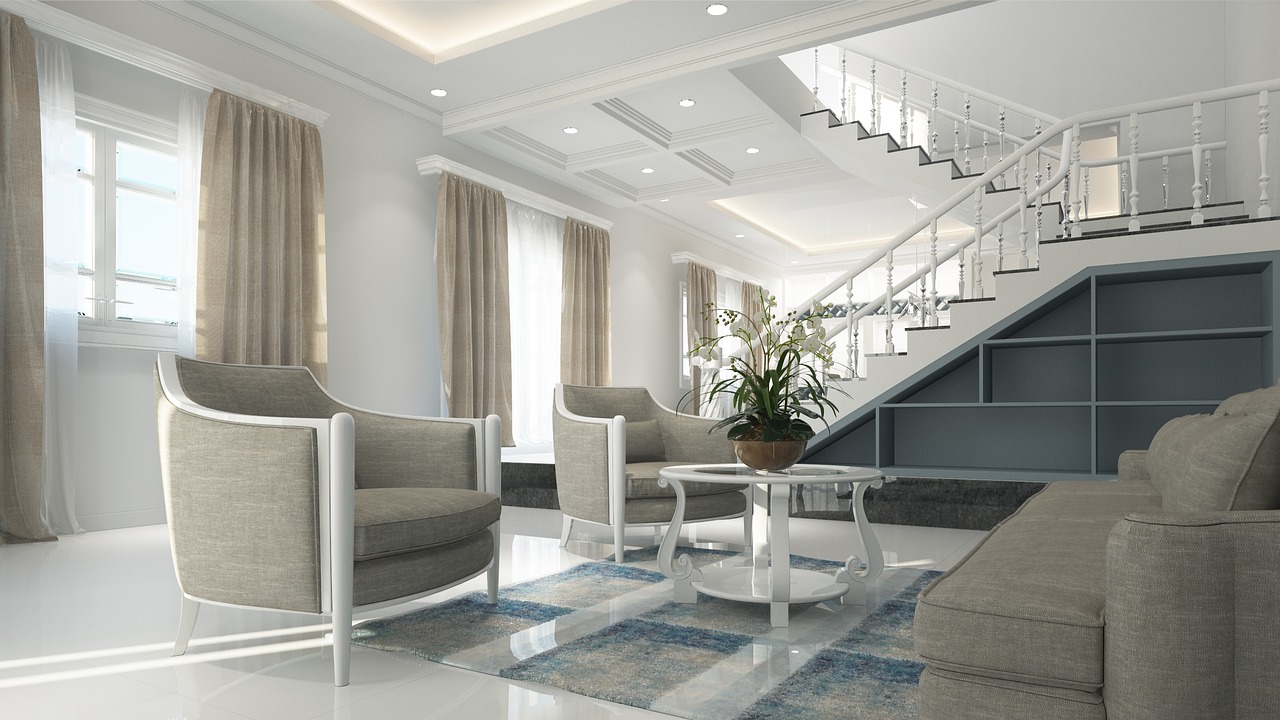
Living room: Layer multiple seating textures, add a statement rug and use lighting to create warmth. A textured feature wall anchors the space.
Bedroom: Prioritise softness. Linen bedding, upholstered headboards and sheer curtains create a restful cocoon. Keep the palette warm and avoid anything too cool or grey, which can feel clinical in a sleeping space.
Kitchen: Neutral kitchens work best with natural material accents like timber chopping boards, stone countertops and woven storage baskets. Matte cabinet finishes in warm white or light grey keep the space feeling clean without harshness.
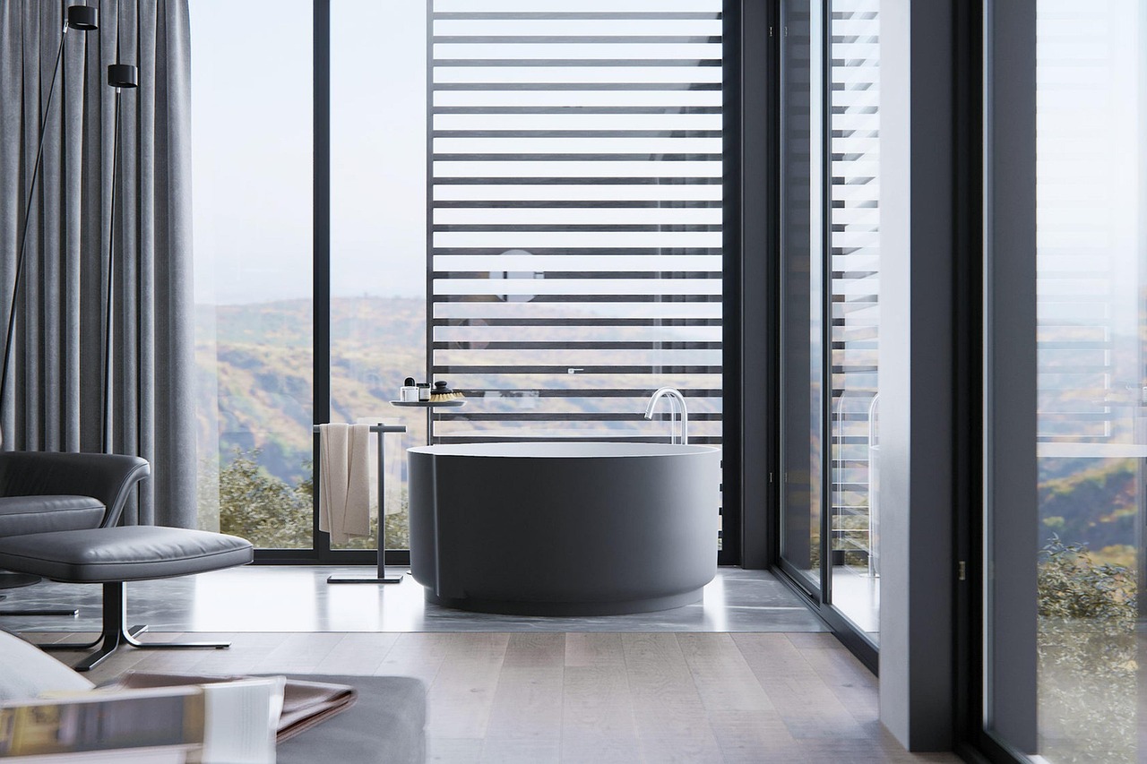
Bathroom: Neutral bathrooms benefit from tactile stone-effect tiles, matte fixtures in brushed nickel or brass, and soft towels in coordinating tones. A warm neutral bathroom feels like a boutique hotel spa.
Why Neutral Design Works in Singapore
Singapore homes, particularly apartments, tend to have compact floor plans where visual clutter accumulates quickly. A neutral palette creates the perception of more space by reducing visual noise. Light-reflecting surfaces and consistent tones draw the eye through the home without interruption.
The tropical light that fills Singapore interiors also favours neutral tones. The warm, bright daylight illuminates textural details and brings out the subtle differences between layered neutrals that might be lost in darker climates.
Finally, neutral design offers practical longevity. Trends come and go, but a well-designed neutral interior remains relevant for years. Updates are easy and affordable, involving cushion swaps, new artwork or a change of rug rather than a full repaint.
Final Thoughts
Neutral interior design is an exercise in subtlety and restraint that, when done well, produces spaces of quiet sophistication. The approach relies on careful material selection, thoughtful textural layering and attention to proportion rather than bold colour statements.
For Singapore homeowners seeking a timeless, versatile home that adapts to evolving tastes without requiring a complete overhaul, neutral design is a sound investment in lasting style.