Interior Design
Floor and Wall Colour Matching: A Visual Harmony Guide
Why Floor and Wall Colour Matching Matters
The floor and walls are the two largest surfaces in any room. Together, they account for approximately 80 per cent of the visible area, which means their colour relationship defines the room’s entire atmosphere. When these surfaces harmonise, a room feels intentional and cohesive. When they clash, even beautiful furniture and accessories cannot compensate.
Colour matching between floors and walls is not about finding identical shades. It is about understanding undertones, contrast levels, and how colours interact when placed in proximity across large surface areas.
Understanding Undertones
Every colour has an undertone — a subtle secondary hue beneath the surface colour. Undertone matching is the single most important principle in floor-wall coordination.
| Undertone | Characteristics | Flooring Examples | Wall Colours That Work |
|---|---|---|---|
| Warm (yellow, red, orange) | Inviting, cosy, traditional | Golden oak, warm walnut, honey maple | Cream, warm grey, terracotta, olive |
| Cool (blue, grey, green) | Crisp, modern, airy | Grey-washed oak, cool slate, pale ash | Cool white, blue-grey, sage, lavender |
| Neutral (balanced) | Versatile, adaptable | True grey, beige-grey (greige) | Most colours — both warm and cool |
The fundamental rule: match warm undertones with warm undertones, and cool with cool. A golden oak floor paired with a cool blue-grey wall creates a visual tension that makes both elements look wrong, even though each is attractive on its own.
Contrast Levels
The degree of contrast between floor and wall colour dramatically affects how a room feels.
Low Contrast (Tonal Matching)
Floor and wall colours are close in value — both light, both mid-tone, or both dark. Low contrast creates a calm, seamless environment where the eye moves smoothly without sharp transitions. This approach suits bedrooms, bathrooms, and spaces designed for relaxation.
Be cautious with low contrast in small rooms — without enough differentiation, the boundaries between surfaces blur and the room can feel undefined.
Medium Contrast
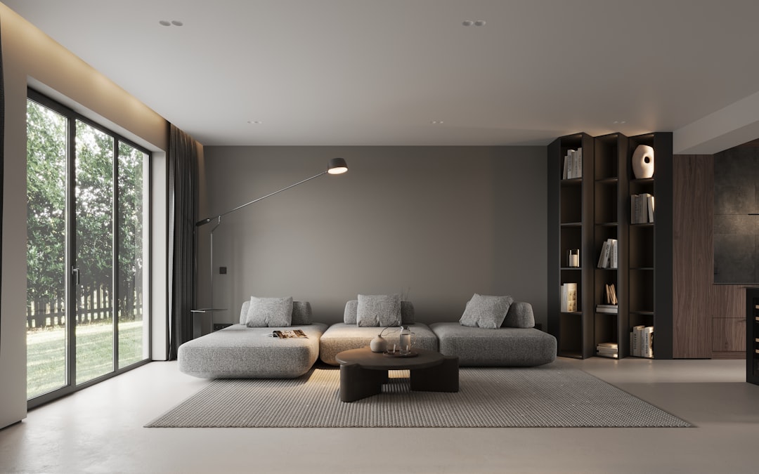
The most versatile approach. Medium contrast creates enough distinction between floor and walls to give the room structure while maintaining harmony. A mid-tone timber floor with pale walls, or a pale floor with mid-tone wall colour, are classic examples.
Most successful Singapore interiors operate in the medium contrast range — it suits the compact room sizes of HDB flats and condominiums while adding visual interest.
High Contrast
Dark floor with white walls, or white floor with dark walls. High contrast is dramatic and bold. It defines surfaces sharply and creates a strong architectural quality. This works best in rooms with good natural light and sufficient size to handle the visual weight.
Proven Floor and Wall Combinations
Light Wood Floor + White Walls
The modern classic. Light oak or ash-toned flooring with white or off-white walls creates a bright, airy, Scandinavian-inspired space. This combination works in virtually every room and is especially effective in compact Singapore homes.
Medium Wood Floor + Warm Neutral Walls
Natural timber tones — from honey to medium walnut — pair beautifully with warm neutral walls in shades of taupe, warm grey, or greige. This creates a comfortable, grounded atmosphere suited to living rooms and dining areas.
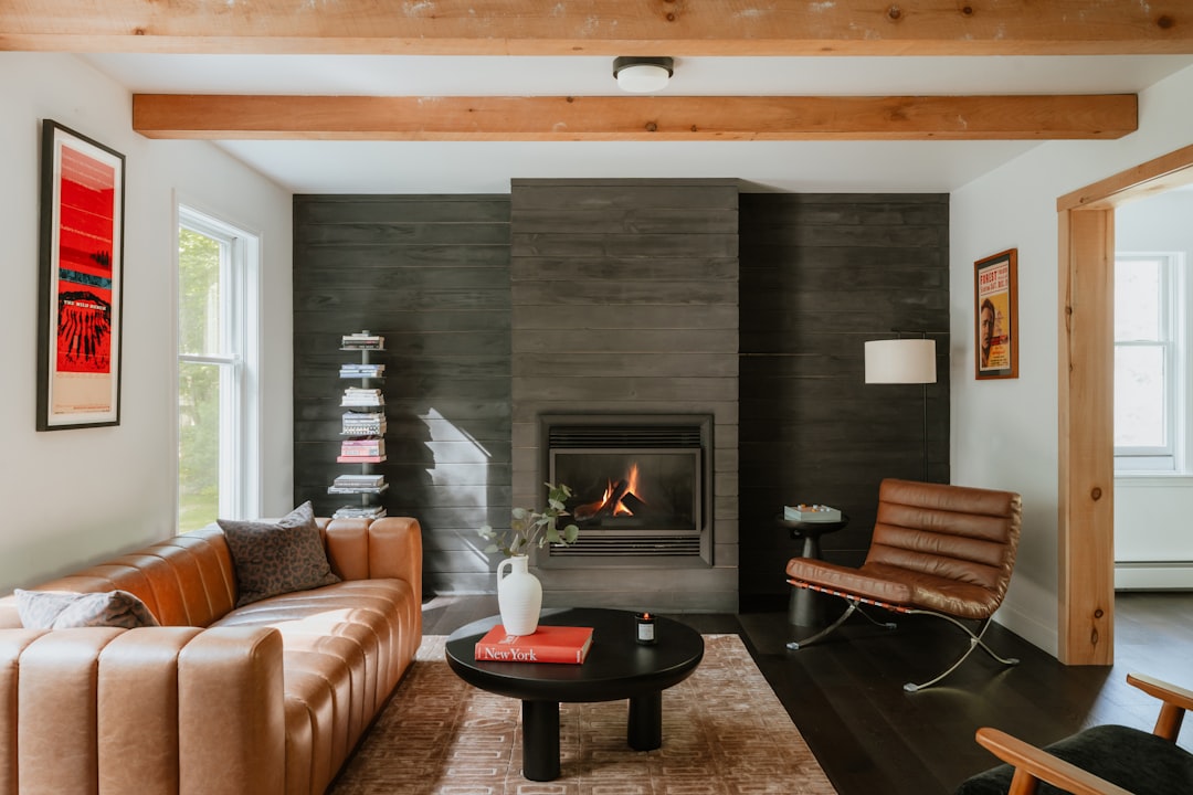
Dark Wood Floor + Pale Walls
High contrast that creates sophistication and drama. The dark floor anchors the room while pale walls keep it feeling spacious. Add warm lighting and textured accessories to prevent the composition from feeling stark.
Grey Floor + Blue-Toned Walls
A contemporary combination that feels fresh and modern. Grey flooring in cool tones pairs naturally with dusty blue, navy accent walls, or soft grey-blue. This palette suits modern condominiums and appeals to homeowners who favour cool colour temperatures.
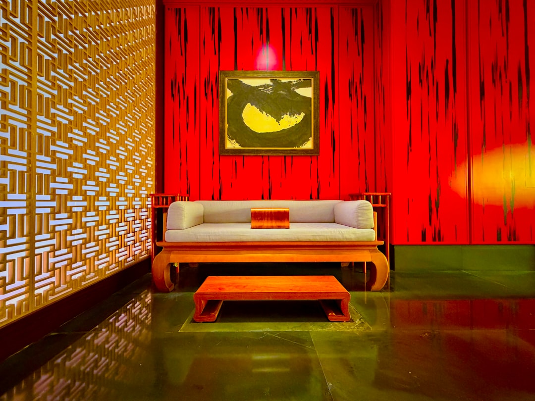
White Floor + Deep Coloured Walls
White marble-effect or whitewashed flooring with rich wall colours — deep green, navy, burgundy — creates a jewel-box effect. The light floor prevents the room from feeling enclosed, while the coloured walls add drama and personality. This works particularly well with textured wallpaper that adds depth to the wall colour.
Common Mistakes to Avoid
- Mixing warm and cool undertones: A warm honey floor with blue-grey walls creates discord. Always check undertones in the same lighting conditions.
- Matching too exactly: Floor and walls in the same colour and tone blend together, eliminating visual boundaries. Aim for relationship, not replication.
- Ignoring fixed elements: Consider existing cabinetry, door frames, and kitchen countertops when choosing floor and wall colours. These fixed elements must also harmonise.
- Choosing in different lighting: Always compare floor and wall samples in the actual room, at different times of day. Showroom lighting and home lighting are rarely the same.
- Forgetting the ceiling: The ceiling is the fifth wall. A white ceiling with warm walls and floors ties the room together. Painting the ceiling a darker shade than the walls can make a tall room feel cosier.
Testing Your Combination
Before committing, test your floor and wall colour together in the actual space. Here is a reliable process:
- Obtain physical samples of your flooring choice — never rely on screen colours alone
- Paint a 60 x 60 cm test patch of your wall colour on the actual wall
- Place the flooring sample on the floor directly below the paint patch
- View the combination in morning light, afternoon light, and evening artificial light
- Live with the test for at least two to three days before deciding
This investment of time prevents expensive mistakes. Colours that look harmonious under showroom lighting may reveal clashing undertones in your home’s specific light conditions.
Special Considerations for Singapore
Natural Light Variability
Singapore apartments face different directions, and each orientation affects how colours appear. North-facing rooms receive less direct light and benefit from warmer tones. West-facing rooms get intense afternoon sun that can wash out cool colours and amplify warm ones.
Air Conditioning Effect
Fluorescent and LED lighting in air-conditioned rooms casts different colour temperatures than natural light. If your rooms are primarily air-conditioned and artificially lit (common in Singapore), evaluate your colour choices under those specific conditions.
Open-Plan Considerations
In open-plan HDB and condo layouts, the floor typically runs continuously through multiple zones. The wall colour may change between zones, but each wall colour must work with the single flooring tone. Choose a floor colour with neutral undertones that bridges warm and cool wall colours across zones.
Using Transition Spaces
Hallways, corridors, and thresholds between rooms are transition spaces where floor and wall colour shifts occur. Handle these transitions carefully:
- Use the corridor as a neutral buffer between rooms with different wall colours
- If the flooring changes between rooms, the transition strip should complement both floor colours
- Maintain consistent skirting board colour throughout to create visual continuity
Build Your Colour Palette
Floor and wall colour matching is the foundation of a well-designed interior. Get this relationship right, and every subsequent decision — furniture, curtains, accessories — falls into place more easily.
Browse our e-catalogue for the latest designs and explore flooring options in the full range of tones, from warm timber to cool stone effects. Pair with wallpaper samples to build your ideal combination.