Interior Design
Home Colour Combinations: Walls, Floors and Furnishings
The Art of Combining Colours in Your Home
Choosing individual colours is one thing. Making them work together across walls, floors, furniture and soft furnishings is another challenge entirely. A beautiful wall colour can look wrong against the wrong flooring. A stunning sofa fabric can clash with the curtains. The magic is in the combination.
This guide takes a practical, material-by-material approach to home colour combinations. Rather than abstract colour theory, it focuses on real decisions Singapore homeowners face: matching flooring to wall colours, coordinating curtain fabrics with upholstery, and creating combinations that look intentional and cohesive.
Flooring and Wall Colour Pairings
The floor and walls together account for the vast majority of visible surface area in any room. Getting this pairing right is the foundation of your colour scheme.
Light Floors With Light Walls
This combination maximises brightness and spaciousness. Light oak or ash-toned luxury vinyl flooring paired with white, cream or pale grey walls is the most popular combination in Singapore HDB and condo renovations. It creates a clean, airy canvas that works with virtually any furniture style.
The risk is blandness. Add warmth through textured wall treatments, warm-toned timber furniture and soft furnishings with depth of colour.
Light Floors With Dark Walls
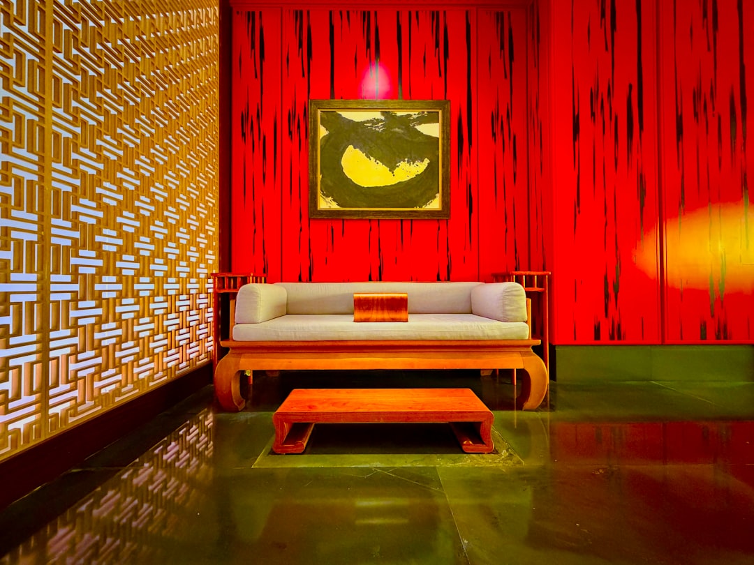
Light flooring provides contrast and balance against dark walls. This pairing works well when you want a dramatic feature wall in navy, forest green or charcoal without the room feeling heavy. The light floor anchors the space and prevents the dark walls from becoming oppressive.
Dark Floors With Light Walls
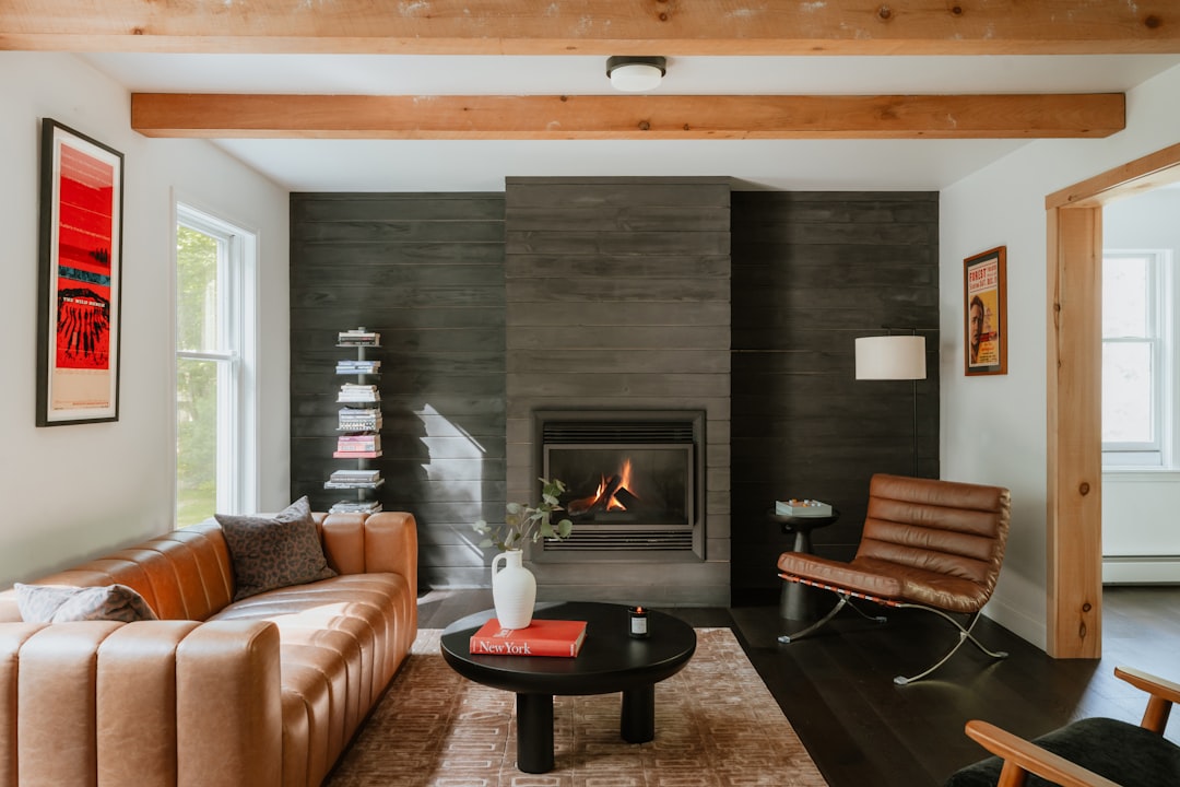
Dark walnut or espresso-toned flooring paired with light walls creates a grounded, traditional aesthetic. The dark floor adds warmth and richness while the light walls maintain brightness. This combination suits classic and transitional interiors.
Dark Floors With Dark Walls
This bold combination creates intimate, cocooning spaces. It works best in rooms with good natural light, high ceilings or generous proportions. In compact HDB flats, use this approach sparingly, perhaps in a master bedroom where an enveloping atmosphere is welcome.
| Combination | Effect | Best For | Caution |
|---|---|---|---|
| Light floor + light walls | Spacious, bright | Small rooms, HDB flats | Can feel bland without texture |
| Light floor + dark walls | Dramatic, balanced | Feature walls, living rooms | Limit dark walls to 1-2 surfaces |
| Dark floor + light walls | Grounded, classic | Traditional interiors, larger rooms | Shows dust and debris more |
| Dark floor + dark walls | Intimate, enveloping | Bedrooms, rooms with high ceilings | Avoid in small, poorly lit rooms |
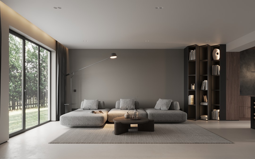
Medium-Toned Floors: The Versatile Middle Ground
Medium-toned flooring in warm walnut, honey oak or natural teak offers the most flexibility. It works with both light and dark walls, does not show dust as readily as dark floors, and avoids the sometimes stark look of very light flooring. This middle-ground option suits homeowners who want a forgiving, adaptable base that accommodates future colour changes on the walls and in soft furnishings.
Curtain and Upholstery Colour Coordination
Soft furnishings bring a room to life. Coordinating curtain fabrics with upholstery ensures a pulled-together look without everything matching too precisely.
Tone-on-Tone
Choose curtains and upholstery in the same colour family but in different shades. A sand-coloured sofa with cream curtains, or a grey sofa with charcoal curtains, creates harmony through tonal variation. This approach is fail-safe and suits most interiors.
Complementary Coordination
Pair curtain and upholstery colours that complement each other without matching. A navy sofa with warm taupe curtains, or a green upholstered chair with rust-toned drapes, creates visual interest through contrast. The colours should feel like they belong together even if they are not the same. Drawing your secondary colour from a colour adjacent on the colour wheel to your primary colour is a reliable way to achieve this harmonious contrast.
Pattern and Plain
If your sofa is upholstered in a plain fabric, curtains with a subtle pattern add visual texture. Conversely, if you have a patterned sofa, plain curtains in a colour drawn from the pattern create balance. Avoid pairing two bold patterns unless they share a common colour and differ in scale.
Explore drapery fabrics and upholstery materials together to find combinations that work. Seeing physical samples side by side is far more reliable than comparing images on a screen.
Wall Treatment and Furniture Pairings
Wallpaper With Furniture
When using patterned wallpaper, keep furniture upholstery simple. A busy wallpaper behind a patterned sofa creates visual noise. Instead, choose a plain sofa in a colour that appears in the wallpaper pattern. This ties the two elements together without competing for attention.
Feature Wall Colours With Furniture
A feature wall in a strong colour needs furniture that does not fight it. Position your most visually simple piece against the feature wall. The feature wall itself is the statement; the furniture in front of it should support, not rival, that statement.
Timber Tones
Different timber tones can clash if not managed carefully. If your flooring has warm, reddish undertones (like cherry or rosewood), match or complement these with timber furniture in similar warm tones. Cool-toned grey or whitewashed timber furniture pairs better with cool-toned grey or blonde wood floors.
Colour Combinations for Specific Rooms
Living Room
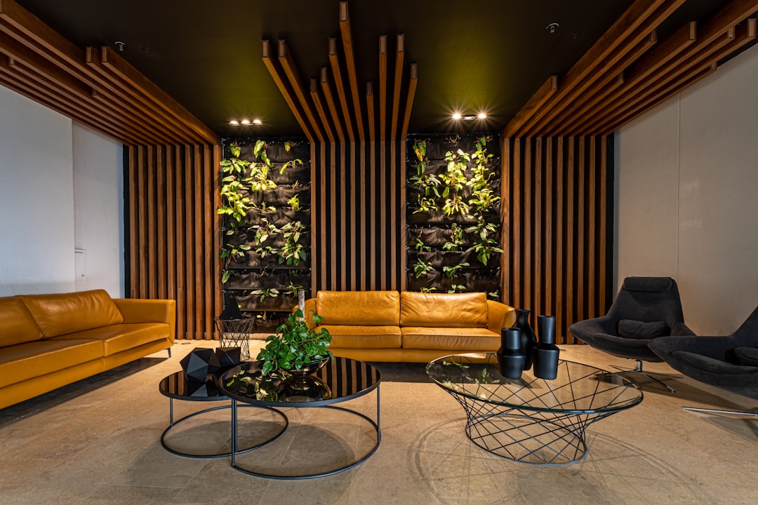
- Classic neutral: Warm white walls, light oak floor, taupe sofa, cream curtains, brass accents
- Contemporary cool: Pale grey walls, grey-toned floor, charcoal sofa, white sheer curtains, black metal accents
- Earthy warmth: Warm beige walls, medium timber floor, terracotta cushions, olive green curtains, rattan accents
Bedroom
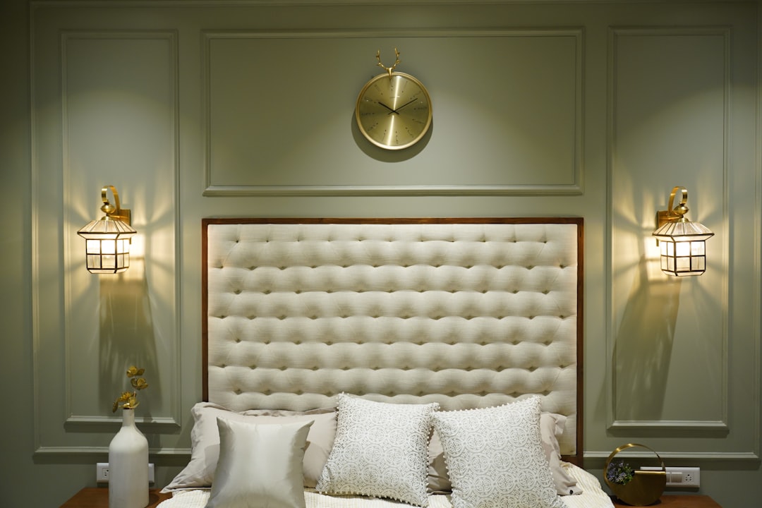
- Restful retreat: Soft blue walls, light floor, white linen bedding, navy wallpaper accent wall behind the bed
- Warm cocoon: Mushroom-toned walls, dark timber floor, camel upholstered headboard, warm grey curtains
- Fresh and bright: White walls, pale ash floor, sage green bedding, natural linen curtains
Dining Area
- Sophisticated: Dark feature wall, light timber dining table, upholstered dining chairs in a warm neutral, pendant light in brass or black
- Casual warmth: White walls, timber table, mixed chair styles in coordinating colours, woven rug underfoot
Common Colour Combination Mistakes
- Too many colours: Limit your palette to three to five colours across the room. More than that creates visual chaos.
- Ignoring undertones: Every colour has an undertone, warm or cool. A grey with blue undertones will clash with a beige that has yellow undertones. Compare samples in natural light to spot undertone conflicts.
- Matching too precisely: A room where everything is the exact same shade feels flat and staged. Slight variations in tone create depth and interest.
- Forgetting the ceiling: A white ceiling against warm-toned walls can appear stark. Consider a softer white or a very pale version of your wall colour for the ceiling.
- Not testing in situ: Colours look different in every room due to light direction, surrounding surfaces and time of day. Always test paint samples on the wall and view fabric swatches in the actual room before committing.
Getting colour combinations right transforms a house into a home. The best combinations feel effortless, as though the colours naturally belong together. That effortlessness comes from careful planning, not from guessing.
Request free samples of our flooring, wallcovering and fabric collections to test colour combinations in your own home. Order your samples here.