Interior Design
Pantone Colour of the Year in Interior Design – Goodrich
The Pantone Colour of the Year shapes interior design trends globally, influencing everything from wallcovering collections to upholstery fabric ranges. For architects, interior designers, and homeowners in Singapore, understanding how to interpret and apply this annual colour selection can bring fresh energy to residential and commercial projects alike.
What the Pantone Colour of the Year Actually Means
Each December, the Pantone Color Institute announces its Colour of the Year after analysing trends across fashion, technology, art, film, and social media. The selection reflects a collective cultural mood and signals the direction that design industries will follow in the coming twelve months.
Past selections have ranged from the calming Classic Blue of 2020 to the exuberant Viva Magenta of 2023 and the soft, grounding Peach Fuzz of 2024. Mocha Mousse, the 2025 selection, brought warm brown tones into focus, while 2026’s Future Dusk, a dusky violet, signals a shift towards contemplative, layered interiors.
It is worth noting that the Pantone selection is a starting point, not a mandate. Successful interior designers use it as creative inspiration rather than applying it literally across every surface. The most sophisticated interiors reference trending colours through accents, textures, and carefully considered material palettes.
How Colour Trends Translate to Interior Materials
The journey from a Pantone swatch to a finished interior involves interpreting the colour across multiple material categories. Each material absorbs and reflects colour differently, which is why a single Pantone reference can look markedly different on wallpaper compared to fabric or flooring.
Wallcoverings
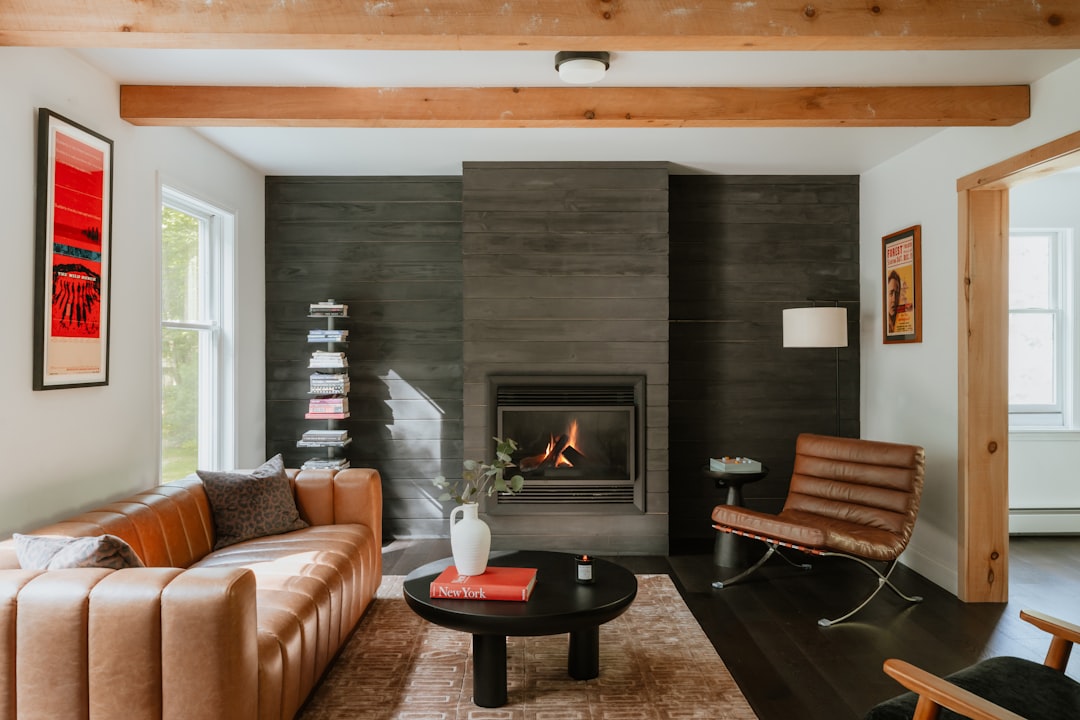
Wallcoverings are one of the fastest ways to incorporate trending colours. Manufacturers typically release collections twelve to eighteen months in advance, so wallpaper ranges available in Singapore often reflect the current Pantone selection. Textured wallcoverings in the trending hue add depth, while patterned options that incorporate the colour as an accent keep the look versatile.
Fabrics
Upholstery and drapery fabrics allow you to introduce colour through soft furnishings that are relatively easy to update. A set of cushion covers or a reupholstered armchair in the year’s trending shade can refresh a room without a full renovation.
Flooring
Flooring is a long-term investment, so most specifiers avoid applying bold trending colours to the floor. Instead, choose flooring tones that complement the Pantone selection. Warm-toned vinyl planks or neutral carpet tiles provide a grounding base that lets wall and fabric colours take centre stage.
Applying Trending Colours in Singapore Homes
Singapore interiors face unique considerations when adopting global colour trends. The abundant natural light in many HDB flats and condos intensifies colour, meaning a shade that looks muted under European overcast skies can appear significantly brighter in a south-facing Singapore living room.
HDB and BTO Flats
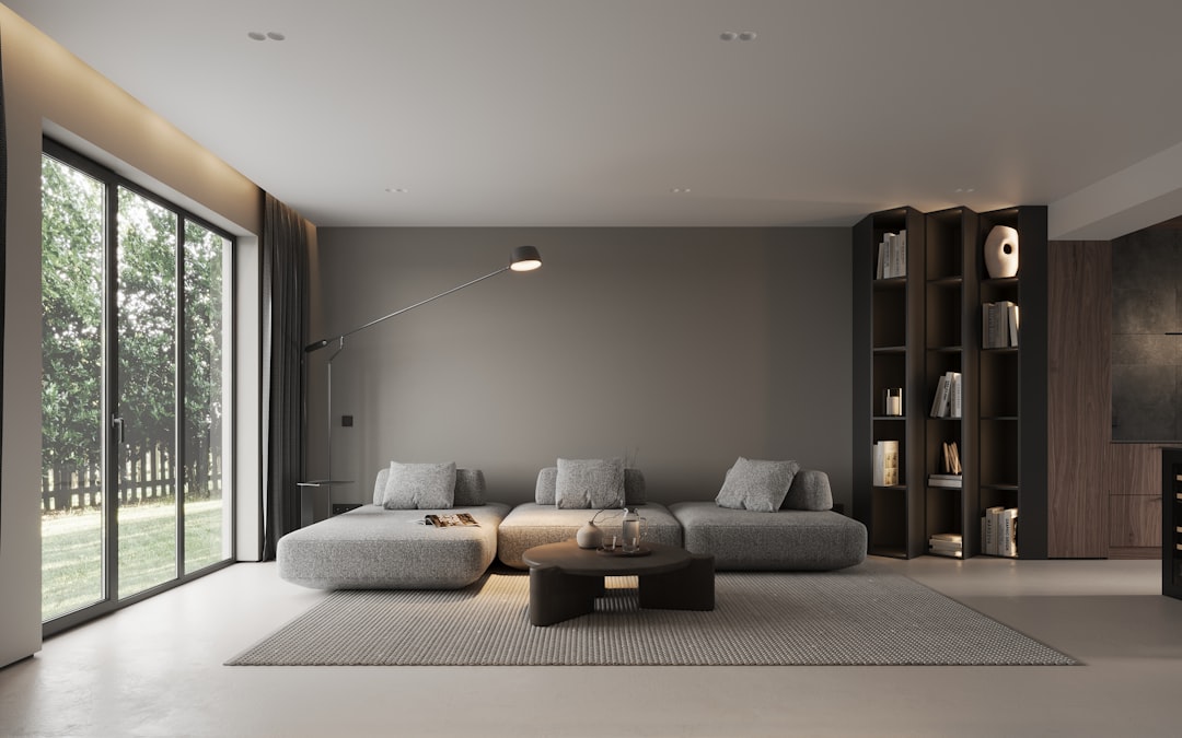
For HDB renovations, consider introducing the trending colour through a feature wall in the living room or master bedroom. Wallpaper is ideal for this purpose because it can be replaced without major renovation work when the trend evolves. Pair the accent colour with white or light grey on remaining walls to maintain visual balance in compact spaces.
Condominiums
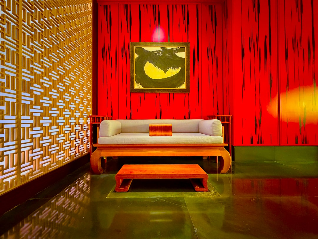
Condo interiors with higher ceilings and larger windows can handle bolder colour applications. A full accent wall, coordinating drapery, and complementary cushions create a cohesive colour story. If the trending colour is particularly bold, use it in a powder room or study where the intensity feels intentional rather than overwhelming.
Commercial Spaces
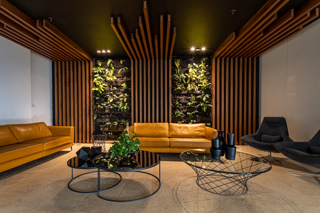
Retail stores, hospitality venues, and co-working spaces often adopt the Pantone Colour of the Year more aggressively, as their design cycles are shorter and they benefit from appearing current. Upholstery fabric for lounge seating and decorative wallcoverings in common areas are effective vehicles for trending colours in commercial contexts.
Building a Colour Palette Around the Annual Selection
No interior should rely on a single colour. The Pantone Colour of the Year works best as part of a considered palette that includes complementary, analogous, or contrasting hues.
| Palette Approach | How It Works | Best For |
|---|---|---|
| Monochromatic | Various tones and shades of the same hue | Sophisticated, calming spaces |
| Analogous | Colours adjacent on the colour wheel | Harmonious, flowing interiors |
| Complementary | Opposite colours on the colour wheel | High-contrast, energetic rooms |
| Neutral base + accent | Neutral walls and floors with pops of the trending colour | Versatile, easy to update |
For most Singapore homes, the neutral base plus accent approach offers the best balance of trend relevance and longevity. It allows you to enjoy the current colour without committing to a full repaint or renovation when the next year’s selection arrives.
When to Follow Trends and When to Ignore Them
Not every Pantone Colour of the Year will suit every project. A bold magenta may be perfect for a boutique hotel lobby but entirely wrong for a conservative law firm’s reception. Good design requires judgement, not blind trend-following.
Consider these guidelines:
- Use trending colours for elements with a short replacement cycle: cushions, throws, artwork, and accessories
- Choose timeless neutrals for permanent fixtures: flooring, cabinetry, and countertops
- Apply bolder colours in smaller doses for maximum impact with minimal risk
- Reference the trending colour’s mood rather than its exact shade if the literal hue does not suit the space
The goal is to create interiors that feel current without becoming dated within twelve months. A light touch with trending colours keeps your spaces fresh while maintaining the enduring quality that good design demands.
Final Thoughts
The Pantone Colour of the Year is a valuable reference point for interior design, but its power lies in thoughtful application rather than wholesale adoption. Whether you incorporate the trending colour through wallcoverings, fabrics, or carefully chosen accents, the key is balancing contemporary relevance with lasting appeal.
Browse our e-catalogue for the latest designs in wallcovering and fabric collections that reflect current colour trends.