Interior Design
Warm-Tone Interior Design: Cosy Colour Palettes
Warm tone interior design centres on colours drawn from the sun, earth and fire end of the spectrum, including terracotta, amber, rust, caramel, warm beige and golden hues. These palettes create spaces that feel inviting, grounded and inherently comfortable, qualities that make them enduringly popular in both residential and hospitality settings.
In Singapore, where air-conditioned interiors can sometimes feel clinical, warm tones counteract that coolness and bring a sense of cosiness that makes a home feel lived-in and loved.
The Psychology of Warm Tones
Warm colours trigger associations with comfort, safety and nourishment. Earthy reds, oranges and yellows are stimulating without being aggressive, making them suitable for social spaces like living rooms, dining areas and kitchens where people gather and connect.
In bedrooms, warmer iterations of the palette, such as dusty pink, muted terracotta and soft caramel, create a cocoon-like atmosphere conducive to rest. The key is in the saturation: deeply saturated warm tones energise, while muted and desaturated versions calm.
Building a Warm Colour Palette
An effective warm-tone palette typically combines a dominant base colour with supporting accent tones and a grounding neutral. Here are three proven combinations.
Palette One: Earthy Terracotta
- Base: Warm white or cream walls
- Accent: Terracotta, burnt sienna and rust through textiles and decor
- Grounding: Dark walnut timber or charcoal for furniture and flooring
Palette Two: Golden Warmth
- Base: Soft sand or warm beige walls
- Accent: Mustard, amber and honey through cushions, throws and artwork
- Grounding: Natural oak flooring and brass metallic accents
Palette Three: Blush and Caramel
- Base: Soft blush or dusty rose feature wall
- Accent: Caramel, tan and cognac leather
- Grounding: Light timber and warm grey supporting tones
Each palette works because it maintains tonal harmony. All the colours share warm undertones, so they sit comfortably together even when they differ in hue and intensity.
Materials That Enhance Warm Interiors
Warm-tone design is as much about material as it is about colour. The right surfaces amplify the warmth of the palette, while mismatched materials can undermine it.
Timber and Wood-Look Finishes
Natural timber is the quintessential warm material. Oak, walnut, teak and ash each bring a different warmth to the space. For Singapore homes where solid timber can be impractical due to humidity, luxury vinyl flooring in warm timber tones offers the same visual effect with superior dimensional stability. Look for planks with realistic grain patterns and matte finishes for the most authentic appearance.
Warm-Toned Wallcoverings
Wallpaper in warm tones adds colour and texture simultaneously. A terracotta grasscloth, a golden damask or a warm linen-textured plain creates a feature wall that anchors the room’s palette. The tactile quality of these wallcoverings enhances the warm atmosphere in a way that flat paint alone cannot achieve.
Browse wallcovering collections for patterns and textures in warm tonal ranges that complement your design scheme.
Soft Furnishing Fabrics
Textiles are where warm palettes come alive. Velvet in rust or amber, linen in natural oatmeal, cotton in warm white and wool in caramel all contribute to the sensory warmth of the space. Layering multiple warm-toned fabrics with different textures creates richness without visual clutter.
For curtains, consider fabrics that filter light with a warm glow. Sheer curtains in champagne or soft gold soften daylight beautifully, while heavier drapes in tonal neutrals provide warmth both visually and thermally in air-conditioned rooms.
Room-by-Room Application
Living Room
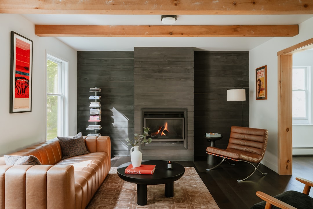
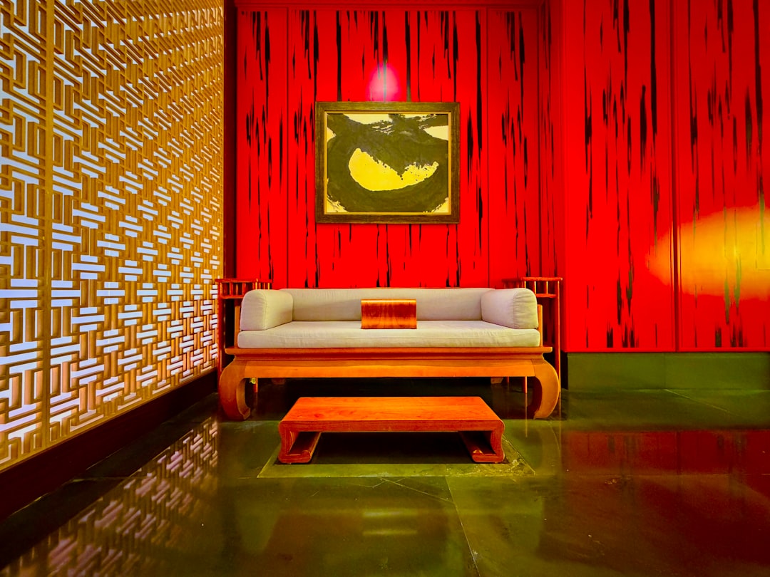
The living room is the ideal canvas for warm-tone design because it benefits from the sociable, inviting quality of the palette. Start with warm-toned flooring, add a feature wall in a complementary wallcovering and layer textiles generously. A caramel or tan leather sofa is a classic centrepiece for a warm living room.
Bedroom
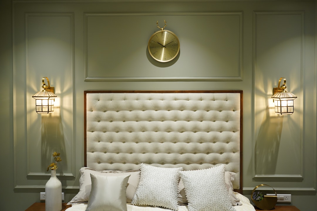
In the bedroom, dial back the intensity. Soft blush, muted terracotta and gentle caramel create a restful environment. An upholstered headboard in a warm-toned fabric becomes the room’s focal point. Pair it with linen bedding in oatmeal or warm white and warm timber bedside tables.
Dining Area
Warm tones stimulate appetite and conversation, making them natural for dining spaces. A timber dining table, warm-toned pendant light and upholstered dining chairs in a rich fabric create a welcoming setting. A wallpapered accent wall behind a sideboard adds a layer of sophistication.
Kitchen
Warm-toned kitchens use materials like timber veneer cabinetry, warm-toned stone countertops and brass or copper hardware. Even in a predominantly white kitchen, warm accents through the backsplash, pendant lighting and bar stools bring the space to life.
Balancing Warmth to Avoid Heaviness
A common pitfall with warm-tone design is overcommitting, which can make a room feel heavy or dark, particularly in smaller Singapore apartments. Balance is essential.
- Include white or cream: Ceilings and some wall surfaces should remain light to reflect daylight and prevent the room from closing in.
- Add cooler accents sparingly: A touch of sage green, dusty blue or charcoal prevents the palette from feeling one-dimensional.
- Use reflective surfaces: Mirrors, glass and metallic finishes in brass or gold bounce light around the room and counteract any heaviness.
- Mind the flooring tone: If walls are warm, a mid-tone floor prevents the room from feeling too enclosed. Very dark warm floors combined with warm walls can feel oppressive in compact spaces.
Warm Tones in Singapore’s Context
Singapore’s tropical light, which is warm and bright, naturally enhances warm-toned interiors. The golden quality of afternoon sunlight filtering through warm-toned curtains creates an atmosphere that cool-palette interiors simply cannot replicate.
However, Singapore homes are also heavily air-conditioned, which can make interiors feel sterile. Warm materials and colours counteract this effect, making the home feel comfortable and inviting despite the mechanical cooling.
For homeowners who want flexibility, a warm neutral base with interchangeable textile accents allows the warmth level to be adjusted seasonally or as preferences evolve. Swap cushion covers and throws to shift the emphasis from deep terracotta in the year-end festive season to lighter caramel and cream for a fresh feel.
Final Thoughts
Warm tone interior design creates spaces that people instinctively want to linger in. By choosing materials with inherent warmth, building layered colour palettes and balancing intensity with light, you can create a home that feels both stylish and genuinely comfortable.
The approach suits Singapore homes particularly well, complementing our tropical light and softening the coolness of air-conditioned interiors. Start with your flooring and walls as the foundation, then layer warmth through textiles and accessories.