Interior Design
Colour Schemes for Interior Design: A Cohesive Home
Why a Colour Scheme Matters
A well-planned colour scheme is the thread that ties an interior together. Without one, even beautifully furnished rooms can feel disjointed, with walls, floors, furniture and fabrics pulling in different directions. With a cohesive colour scheme, every element feels intentional and connected.
In Singapore homes, where open-concept layouts mean multiple zones share a single visual field, colour consistency is particularly important. The living room, dining area and kitchen need to work together harmoniously, not compete for attention.
This guide covers the fundamentals of colour theory as applied to interior design, practical approaches to building a colour scheme, and tips specific to Singapore’s light conditions and housing types.
Colour Theory Basics for Interiors
You do not need a design degree to work with colour effectively. A few foundational concepts go a long way.
The Colour Wheel
The colour wheel organises colours by their relationship to one another. Primary colours (red, blue, yellow) combine to form secondary colours (green, orange, purple), which in turn mix to form tertiary colours. Understanding these relationships helps you choose colours that work together.
Key Colour Relationships
- Monochromatic: Different shades, tints and tones of a single colour. This creates a calm, cohesive look. Example: pale grey walls, charcoal sofa, silver accessories.
- Analogous: Colours that sit next to each other on the colour wheel. These combinations feel natural and harmonious. Example: blue, teal and green.
- Complementary: Colours opposite each other on the colour wheel. These combinations create contrast and energy. Example: navy and burnt orange.
- Triadic: Three colours equally spaced on the colour wheel. These schemes are vibrant and require careful balancing. Example: terracotta, sage green and soft blue.
Warm vs Cool Colours
Warm colours (reds, oranges, yellows) advance visually, making spaces feel cosier and more intimate. Cool colours (blues, greens, purples) recede, making spaces feel larger and calmer. In Singapore’s tropical climate, cool tones can help interiors feel refreshing, while warm tones create inviting, cocooning spaces.
Building Your Colour Scheme
A practical approach to building a colour scheme starts with the 60-30-10 rule, a guideline used by professional designers worldwide.
The 60-30-10 Rule
| Proportion | Role | Typical Application |
|---|---|---|
| 60% | Dominant colour | Walls, large furniture, flooring |
| 30% | Secondary colour | Upholstery, curtains, rugs, feature walls |
| 10% | Accent colour | Cushions, artwork, decorative objects |
The dominant colour is your base. It should be a colour you can live with on large surfaces: walls, flooring and major furniture. Neutrals are the most common choice for the dominant colour because they provide a versatile backdrop.
The secondary colour adds depth and character. This is where you introduce more personality through curtain fabrics, upholstery, rugs and feature walls.
The accent colour is the smallest proportion but often the most memorable. It appears in cushions, artwork, vases and small decorative elements. Because accents are easy and affordable to change, they offer the simplest way to refresh a room without redecorating.
Popular Colour Schemes for Singapore Homes
Warm Neutrals
Warm neutrals, including cream, beige, taupe, warm grey and sand, are the most popular base palette in Singapore homes. They create a welcoming atmosphere, work with natural light and pair well with timber-toned flooring and furniture. This palette suits virtually every housing type from HDB to landed.
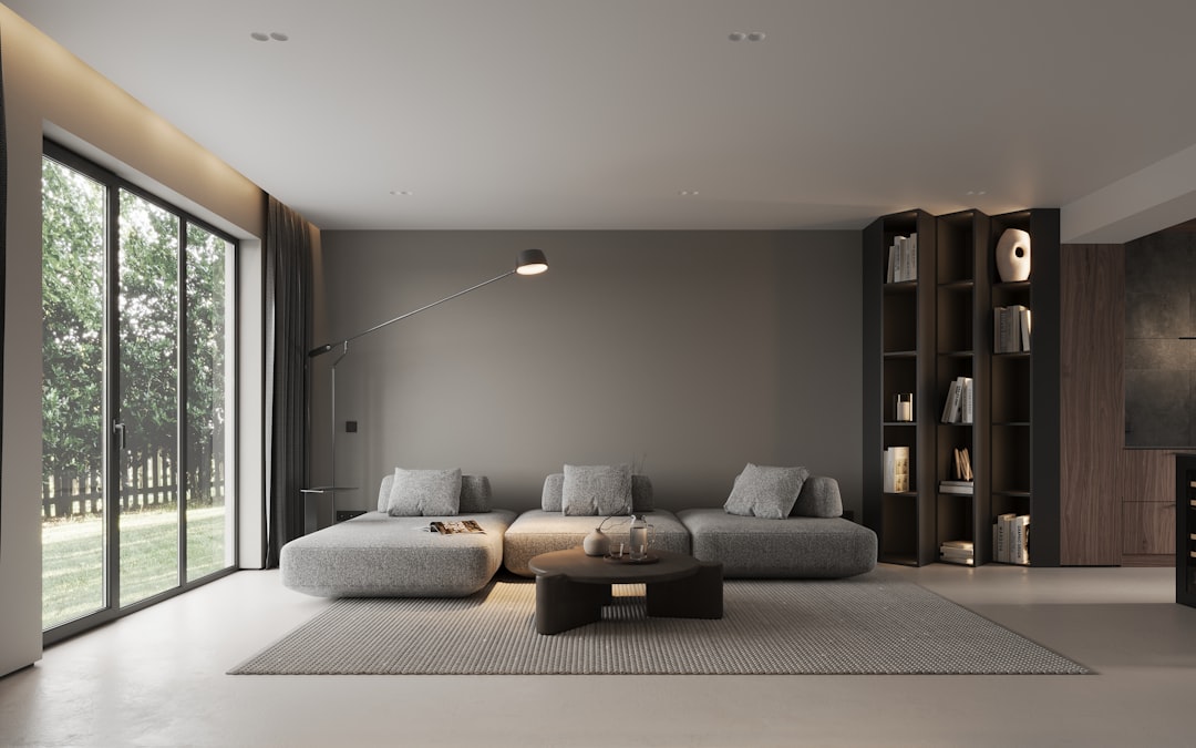
Cool Contemporary
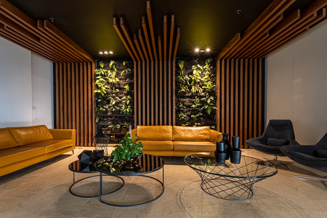
Cool greys paired with white, black accents and touches of pale blue or sage green create a sophisticated contemporary scheme. This palette works particularly well in newer condos with modern architectural lines.
Earthy Organic
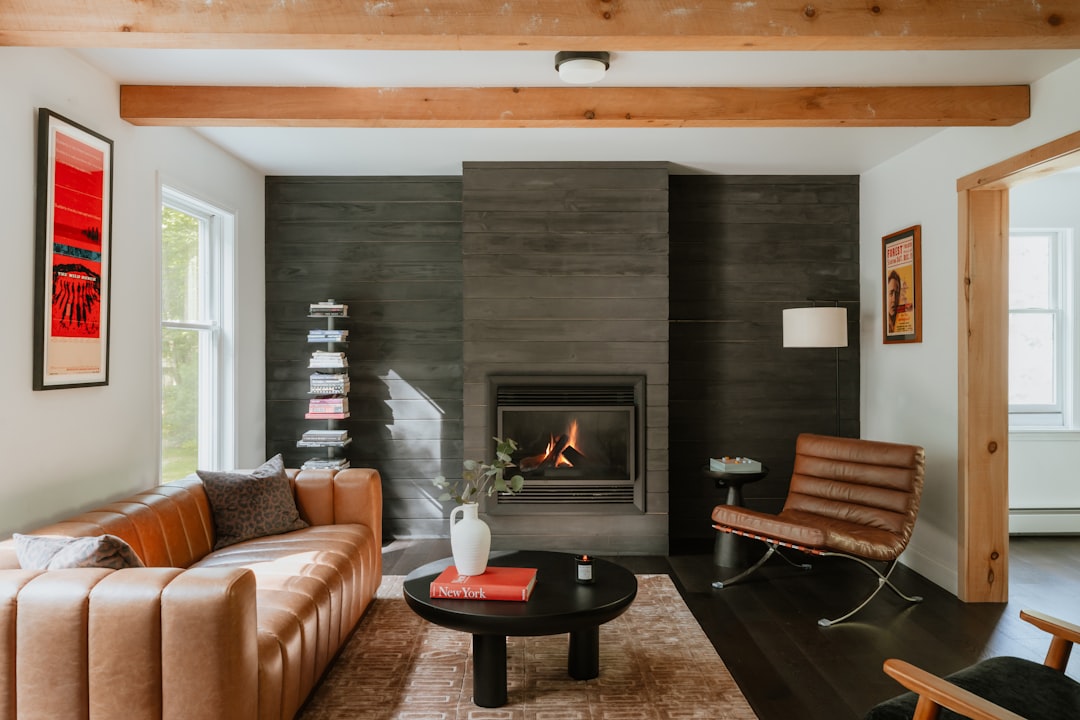
Terracotta, olive green, clay, mushroom and charcoal create a grounded, nature-inspired palette. This scheme pairs beautifully with natural materials like timber, rattan and linen. It brings a sense of calm that counterbalances the urban density of Singapore living.
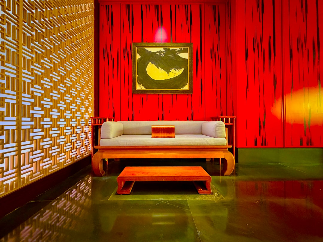
Moody and Bold
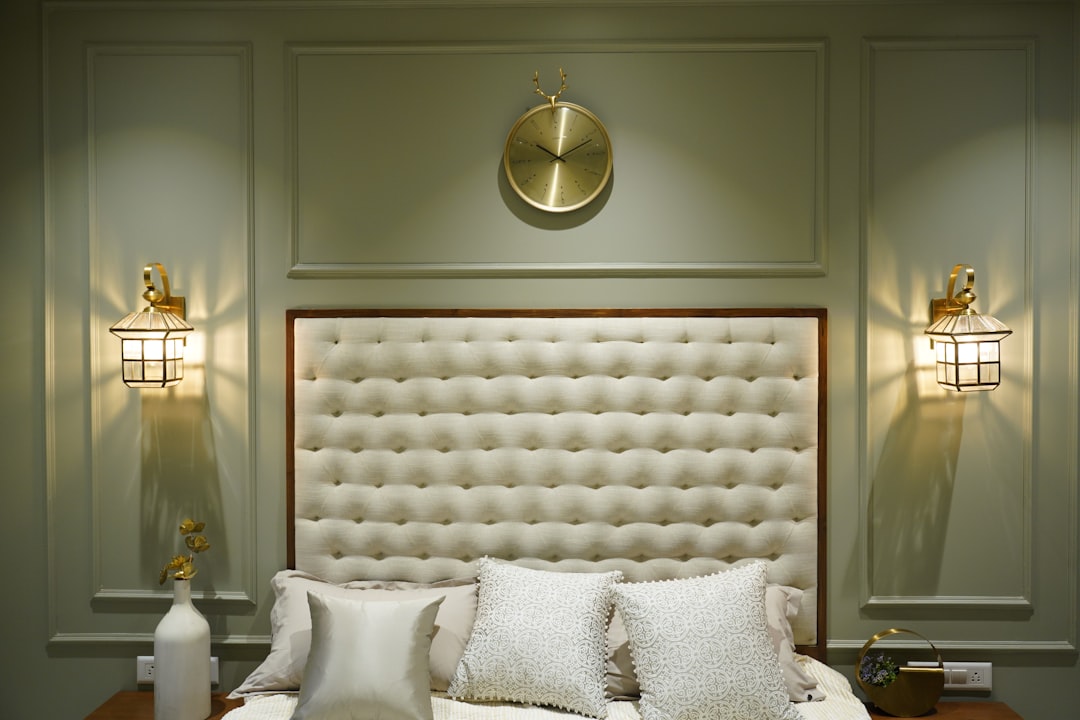
Deep navy, forest green, burgundy and charcoal create dramatic, enveloping interiors. These schemes work best in rooms with good natural light or in spaces where an intimate atmosphere is desired, such as master bedrooms and dining rooms. Balance dark walls with lighter flooring and furnishings to prevent the room from feeling heavy.
Colour and Light in Singapore
Singapore’s equatorial light is intense, warm and consistent throughout the year. This has important implications for colour selection.
- Strong natural light intensifies colours. A paint colour that looks soft in a swatch may appear much stronger on a large wall flooded with tropical sunlight. Always test colours on the actual wall before committing.
- North-facing rooms receive less direct light and can handle warmer colours without them feeling overwhelming. South and west-facing rooms with strong afternoon sun may benefit from cooler tones.
- Air-conditioned rooms vs naturally ventilated rooms create different light environments. Closed curtains in air-conditioned rooms create a more controlled light condition where colours appear more consistent.
- Artificial lighting changes everything. The same wall colour will look different under warm-white, cool-white and daylight LED bulbs. Choose your lighting temperature before finalising your colour scheme.
Applying Colour Across Your Home
A whole-home colour scheme does not mean every room is identical. It means every room is connected by a common thread.
Common Spaces
Living room, dining area and kitchen should share the same base palette with variations in accent colours. Use consistent wall colours and wallcoverings across connected spaces for visual flow.
Bedrooms
Bedrooms can deviate more from the common-area palette since they are private, enclosed rooms. However, maintaining a relationship to the overall scheme, even if just through the flooring or one shared accent colour, creates cohesion when doors are open.
Bathrooms
Bathroom colour schemes often stand apart from the rest of the home. Use the opportunity to introduce a different mood, whether that is a spa-inspired neutral palette or a bold statement colour on an accent wall.
Connecting With Soft Furnishings
Curtain fabrics, cushion covers and upholstery are powerful tools for tying a colour scheme together across rooms. Repeating a fabric colour or texture from the living room curtains in the bedroom cushions, for example, creates a subtle connection that unifies the home.
Common Colour Scheme Mistakes
Even with the best intentions, certain colour mistakes appear repeatedly in Singapore homes. Being aware of them helps you avoid costly repainting or re-covering.
- Choosing colours from a screen: Colours on a computer or phone screen are not accurate representations of how paint, fabric or wallpaper will look in your home. Always view physical samples in the room where they will be used.
- Ignoring transitions: The colour you see from one room looking into another matters. If your living room is warm beige and the adjacent hallway is cool grey, the transition will feel jarring. Plan sightlines between rooms.
- Using too many accent colours: One or two accent colours create focus. Three or more create confusion. Discipline with accents is essential.
- Forgetting about existing elements: If you are not replacing your flooring, furniture or cabinetry, your new colour scheme must work with what is already there. Start from what you cannot change and build outward.
A thoughtful colour scheme is one of the most effective and affordable ways to elevate your home interior. It requires planning and restraint, but the result is a home that feels designed, cohesive and distinctly yours.
Browse our e-catalogue for fabric and wallcovering options in every colour palette. Explore the catalogue here.