Interior Design
Colour Trends 2026: What’s Next in Interior Design
Colour trends for 2026 in interior design reflect a collective desire for warmth, groundedness, and connection to the natural world. After years of cool minimalism and stark neutrals, the palette is shifting toward richer, more layered tones that bring emotional depth to living and working spaces.
For architects, designers, and homeowners in Singapore, understanding these colour directions helps inform decisions about wallcovering, flooring, fabric, and overall interior schemes that will feel current for years to come.
The Defining Palettes of 2026
This year’s colour landscape is organised around four interconnected palettes, each reflecting a different facet of contemporary living. These are not fleeting fads but considered shifts that build on movements already underway in the design world.
Warm Earth
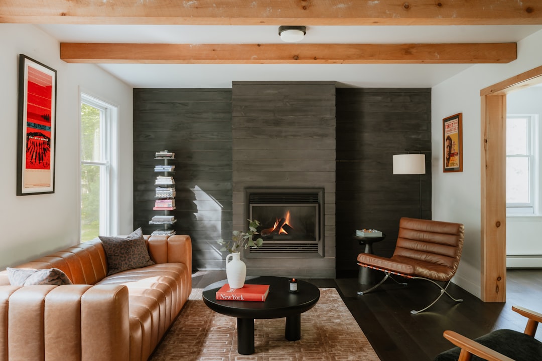
Terracotta, burnt sienna, ochre, and clay are the anchors of this palette. These are colours drawn from sun-baked landscapes and natural minerals, bringing warmth and richness to interiors without the heaviness of darker tones. In Singapore, where natural light is abundant, warm earth tones glow beautifully and complement the tropical greenery visible through windows.
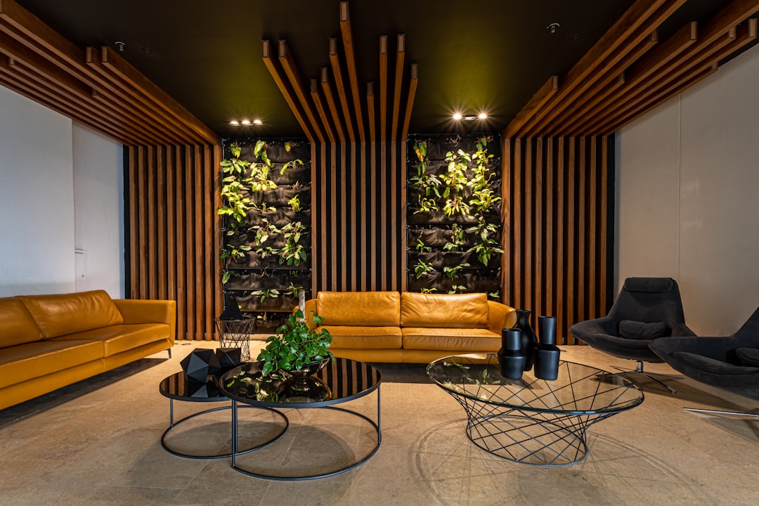
Botanical Green
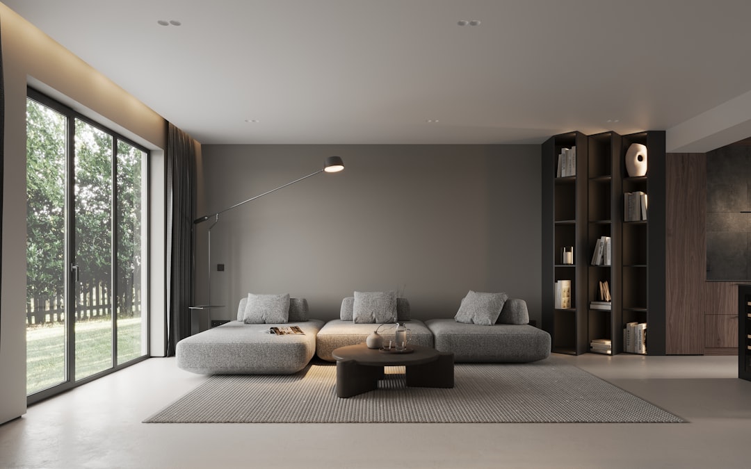
Green continues its reign, but the 2026 iteration is more nuanced. Sage, olive, and moss replace the brighter emeralds of recent years. These muted, grey-inflected greens feel sophisticated rather than trendy, and they pair exceptionally well with natural materials such as timber, linen, and stone.
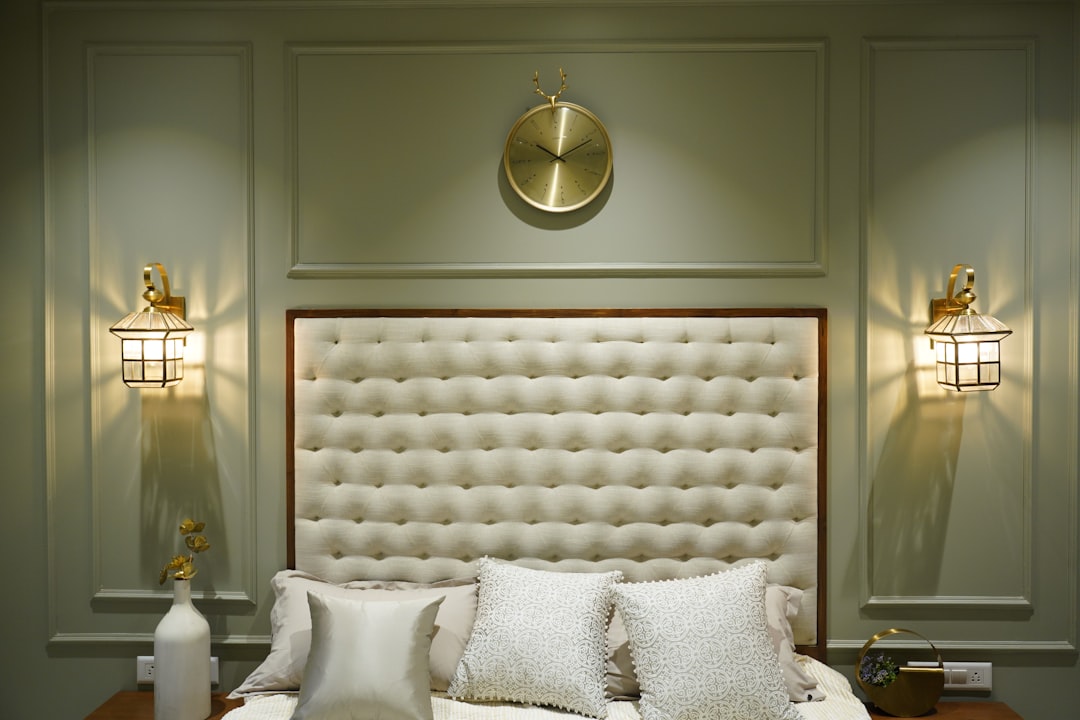
Dusted Pastels
Pastels are back, but with a mature edge. Think dusty rose rather than baby pink, muted lilac rather than bright lavender, and powdery blue rather than sky blue. These desaturated tones add softness to interiors without feeling saccharine, making them suitable for both residential and commercial spaces.
Deep Comfort
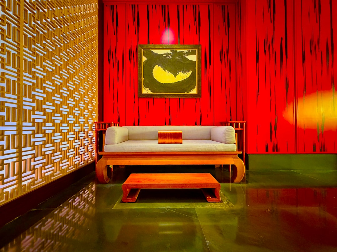
At the other end of the spectrum, deep, enveloping tones are gaining confidence. Midnight blue, aubergine, charcoal brown, and forest green create intimate, cocoon-like spaces. These colours work particularly well in bedrooms, studies, and restaurant interiors where a sense of enclosure is desirable.
How These Trends Translate to Wallcovering
Wallcovering is where colour trends often find their most expressive application. Unlike paint, wallcovering combines colour with texture and pattern, adding dimension that a flat surface cannot achieve.
Key wallcovering directions for 2026 include:
- Tonal texture: Single-colour wallcoverings with pronounced texture, such as grasscloth in olive or linen-effect in terracotta, let colour and surface interplay without competing patterns.
- Colour-drenched florals: Large-scale botanical prints in the warm earth palette create immersive feature walls. These are not delicate florals but bold, painterly compositions.
- Ombre and gradient effects: Wallcoverings that shift between two related tones add movement and depth to a wall without the visual weight of a strong pattern.
Explore the latest wallpaper and wallcovering collections to see how these colour directions translate into real products for your projects.
Colour Trends in Flooring
Flooring colour sets the foundation for every other material decision in a room. In 2026, the movement is toward warmer, more characterful tones that anchor interiors with a sense of place.
The dominant flooring colour trends include:
- Warm timber tones: Golden oak, honey walnut, and amber maple are replacing the cool grey-washed timbers that dominated the past decade. These warmer tones add life and energy to a room.
- Rich stone effects: Dark limestone, travertine, and warm sandstone finishes in LVT and SPC products bring the character of natural stone without the maintenance demands.
- Earthy carpet palettes: Carpet tiles and broadloom in clay, sage, and sand tones are replacing the corporate greys of commercial interiors, particularly in hospitality and co-working spaces.
Browse the flooring range for options that align with the latest colour directions.
Fabric and Upholstery Colour Directions
Fabrics bring colour to the elements people interact with most directly: seating, curtains, cushions, and bedding. In 2026, fabric colour choices are guided by a desire for tactile comfort and visual warmth.
Key directions include:
- Tonal layering: Using multiple shades of the same colour family, for example pairing a dusty rose curtain with a deeper berry upholstery, creates depth without visual conflict.
- Contrast through saturation: Combining a muted wall colour with a more saturated fabric in the same family, such as sage walls with rich olive curtains, adds energy while maintaining cohesion.
- Natural fibre colours: Undyed linen, raw silk, and natural cotton in their inherent cream, flax, and ecru tones are gaining popularity as a counterpoint to coloured accents.
For Singapore interiors, where the climate demands performance fabrics, it is reassuring that these colour trends are well-represented across stain-resistant and UV-stable textile ranges.
Applying 2026 Colour Trends in Singapore
Singapore’s interior design context presents specific opportunities and considerations when adopting colour trends.
Light and Climate
Equatorial light is strong and warm, which means colours read differently here than in Northern Europe or North America. Cool tones can appear flat under Singapore’s natural light, while warm tones come alive. This is one reason the shift toward warmer palettes feels particularly natural for local interiors.
Property Types
In HDB flats, where rooms are modest in size, the dusted pastel palette works exceptionally well. These light, muted tones open up spaces visually while adding more character than plain white. An accent wall in a deeper tone from the warm earth or botanical green palette provides a focal point without overwhelming the room.
In condominiums, the deep comfort palette suits bedrooms and studies, creating intimate retreats within an otherwise open-plan layout. Common areas benefit from the botanical green palette, which connects the interior to the landscaped gardens visible from many condo units.
For landed properties, where room sizes allow for bolder choices, the warm earth palette creates cohesive, enveloping interiors. A living room with terracotta wallcovering, honey-toned LVT flooring, and olive linen curtains exemplifies the layered warmth that defines the 2026 colour mood.
Commercial Applications
The colour trends translate naturally into commercial settings. Hospitality spaces benefit from the warm earth palette, which creates welcoming, memorable environments. Office fit-outs are moving toward botanical greens and dusted pastels, replacing the sterile greys that dominated corporate interiors for years. Healthcare spaces are embracing softer, warmer neutrals that reduce institutional coldness.
Final Thoughts
Colour trends for 2026 in interior design favour warmth, depth, and natural connection. For Singapore designers and homeowners, these directions align well with the local light, climate, and lifestyle, making them both aesthetically appealing and practically sound.
The key to applying any trend is selectivity. Choose one or two palettes that resonate with your project and apply them consistently across surfaces, from walls to floors to fabrics, for a cohesive result.
Browse our e-catalogue for the latest designs and see how the 2026 colour palettes come to life across our collections.