Wallpaper & Wallcovering
Wallpaper Colour Guide: Choosing the Right Palette
Why Wallpaper Colour Selection Matters
Walls account for the largest vertical surface area in any room. The colour you put on them influences everything — the room’s perceived size, the mood it creates, how well your furniture looks, and even how you feel when spending time in the space. When that colour comes in the form of wallpaper, with its inherent texture and depth, the impact is amplified further.
Choosing wallpaper colour differs from choosing paint colour in important ways. Wallpaper textures interact with colour to produce effects that flat paint cannot replicate — a blue linen-weave wallpaper looks and feels different from blue paint, even in the identical shade. Understanding this interaction is key to making confident colour decisions.
Colour Psychology for Interior Spaces
Colour influences mood and behaviour. While individual responses vary, broad colour psychology principles provide useful guidance for room-by-room wallpaper selection.
| Colour Family | Psychological Effect | Best Rooms | Singapore Considerations |
|---|---|---|---|
| Blue | Calm, focused, restful | Bedrooms, home offices, bathrooms | Cool tones balance warm climate |
| Green | Restorative, balanced, natural | Living rooms, bedrooms, studies | Connects to tropical surroundings |
| Yellow | Cheerful, energising, optimistic | Kitchens, dining areas, hallways | Use soft tones; bright yellow can overwhelm |
| Grey | Sophisticated, calm, neutral | Any room | Check undertones under your lighting |
| White / cream | Clean, open, fresh | Any room; especially small spaces | Textured white wallpaper avoids sterile feel |
| Warm neutrals (beige, taupe) | Inviting, grounding, cosy | Living rooms, bedrooms, family areas | Universally safe; broad appeal for resale |
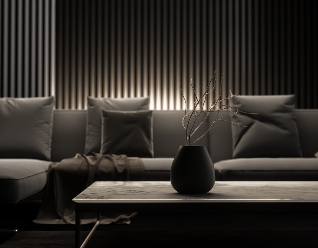
| Dark tones (navy, charcoal, forest) | Intimate, dramatic, luxurious | Feature walls, master bedrooms, dining | Balance with light furnishings and adequate lighting |
Choosing Wallpaper Colour by Room
Each room serves a different function and benefits from colours that support that purpose.
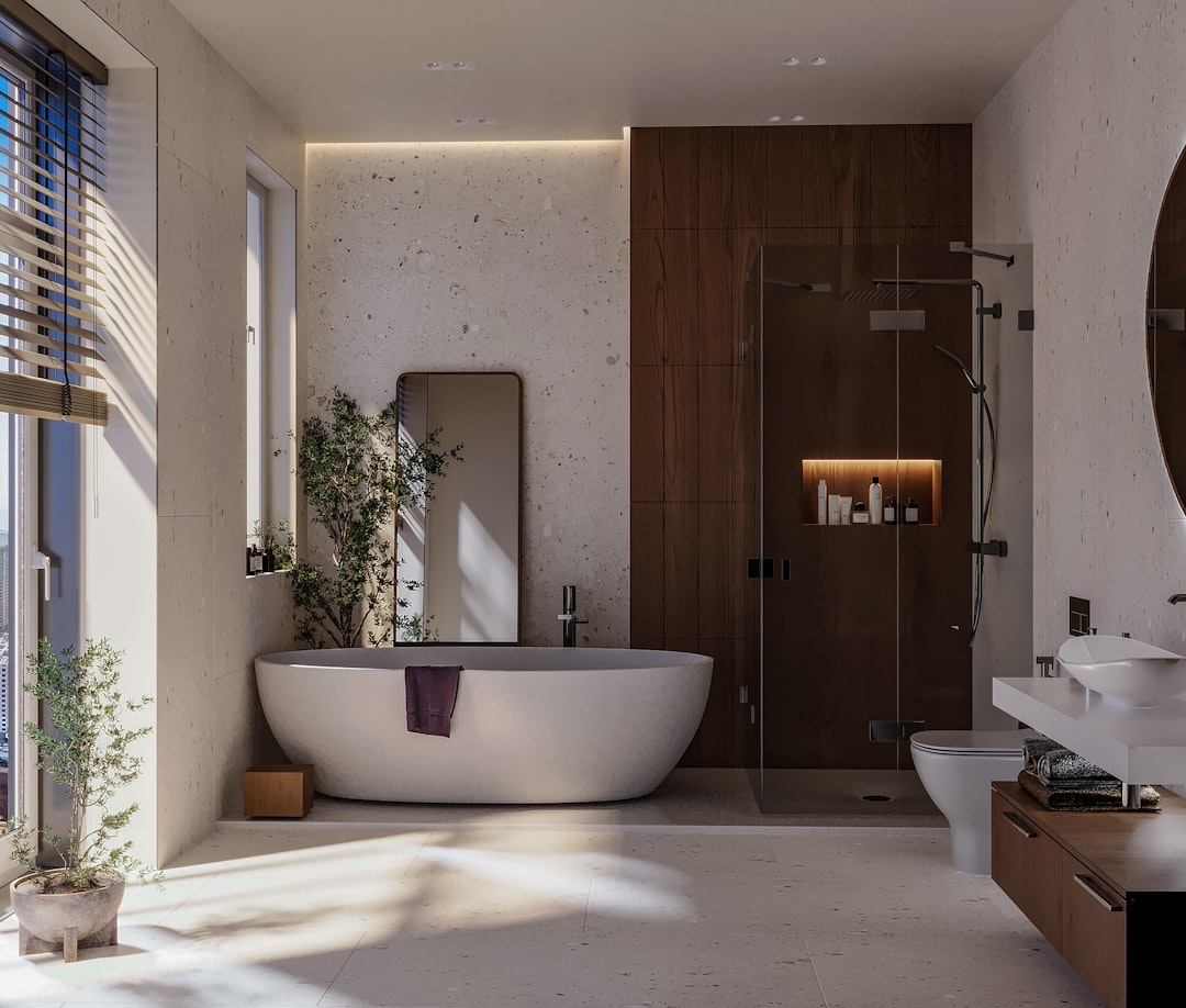
Living room: As the main social space, the living room benefits from colours that are welcoming without being overstimulating. Warm neutrals, soft greens, and mid-tone greys create inviting atmospheres. For feature walls, deeper tones — navy, forest green, or charcoal — add character and sophistication. Browse residential wallcovering collections to find the right palette for your living area.
Bedroom: Restful colours promote better sleep. Soft blues, muted greens, warm greys, and gentle lavenders are proven bedroom choices. Avoid highly stimulating colours like bright red or orange on bedroom walls. If you want warmth, choose blush, dusty rose, or warm beige rather than vivid warm hues.
Dining area: Warmer tones — soft terracotta, warm grey, muted gold — create a convivial dining atmosphere. Richer colours encourage lingering at the table, which is why many restaurants use deep reds, warm oranges, and earthy tones in their dining rooms.
Children’s room: While primary colours are the traditional choice, contemporary children’s rooms increasingly feature softer palettes — sage green, soft blue, warm peach, or light grey — that grow with the child. These calming tones also promote better rest, which matters in a room that serves as both play space and sleeping area.
Home office: Colours that support concentration without causing fatigue work best. Muted blue-greens, warm greys, and soft sage are effective. Avoid white walls that create screen glare, and avoid dark walls that absorb too much light in what is typically a task-oriented space.
How Light Affects Wallpaper Colour
The same wallpaper looks different in every room because light transforms colour. Understanding this relationship prevents costly surprises.
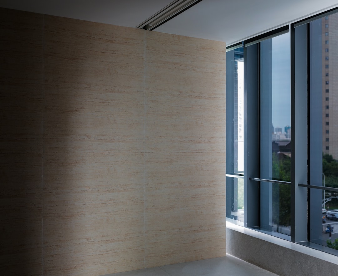
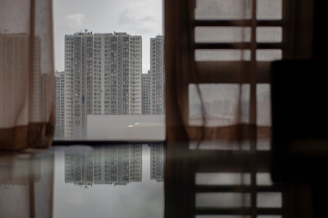
Natural light direction: North-facing rooms in Singapore receive cool, indirect light that makes warm colours appear slightly muted and cool colours look even cooler. South and west-facing rooms receive warm, direct sunlight that enhances warm tones and softens cool ones. East-facing rooms get bright morning light and softer afternoon light, creating colour shifts throughout the day.
Artificial lighting: Warm-white LEDs (2,700K to 3,000K) enhance warm-toned wallpapers and can add an unwanted yellow or green cast to cool greys and blues. Cool-white lighting (4,000K and above) makes cool colours pop but can flatten warm tones. Ideally, match your lighting colour temperature to your wallpaper colour family.
Room size and colour reflection: In small rooms, walls are close together and reflect colour onto each other, intensifying the effect. A colour that looks subtle on a single sample can feel considerably stronger when it surrounds you on all four walls. This is why sampling on the actual wall — not just holding a swatch — is so important.
Coordinating Wallpaper Colour with Existing Interiors
Unless you are renovating the entire room simultaneously, your wallpaper must work with existing elements — flooring, furniture, cabinetry, and soft furnishings.
Start with what you cannot change: Identify the fixed elements in the room. Kitchen cabinets, bathroom vanities, built-in wardrobes, and flooring are typically the most permanent. Your wallpaper colour should complement these elements rather than clash with them.
Use the undertone as your guide: Determine whether your fixed elements lean warm (yellow, red, or brown undertones) or cool (blue, green, or grey undertones). Match your wallpaper to the same temperature family for harmony, or deliberately contrast for visual energy.
Create a colour story: The most cohesive interiors use a limited palette of 3 to 5 colours that flow through every room. Your wallpaper colours should be part of this story, not isolated choices that create jarring transitions between rooms.
Consider flow between rooms: In open-plan Singapore homes where rooms are visually connected, wallpaper colours in one area should relate to colours in adjacent spaces. They do not need to match, but they should feel like they belong in the same home.
Colour Trends vs Timeless Choices
Interior colour trends shift over time. What feels fresh and current today may look dated within five to seven years. For wallpaper — which represents a more significant commitment than paint — balancing trend awareness with timeless appeal is important.
Currently trending wallpaper colours in Singapore include sage green, dusty pink, warm terracotta, and deep forest green. These are beautiful choices that can create striking interiors, but they carry more trend risk than established neutrals. If you choose a trending colour, consider applying it to a single feature wall rather than all four walls. This limits the commitment and makes future updates simpler.
Timeless wallpaper colours — warm white, soft grey, beige, navy, and muted sage — have proven their staying power across multiple design cycles. These colours remain relevant decade after decade because they serve as backgrounds rather than statements, adapting to changing furniture and accessory trends without requiring replacement.
How to Sample Wallpaper Colours Effectively
Confident wallpaper colour selection requires proper sampling. Screen images, catalogue photos, and small swatches are starting points only — never final decision tools.
- Request the largest samples available — ideally A4 or larger pieces that show both the colour and the texture pattern.
- Tape samples to your wall at eye level. View them from different angles and distances.
- Observe the samples at different times of day — morning, afternoon, and evening under artificial light. Colours shift dramatically between these conditions.
- Place samples near your existing flooring, furniture, and fixed elements. Compatibility with real surroundings matters more than how the colour looks in isolation.
- Live with the samples for 2 to 3 days before deciding. First impressions can be misleading; extended viewing reveals whether you genuinely enjoy the colour.
- If choosing between two options, the more neutral, lighter option is typically the safer long-term choice for Singapore homes.
Start your wallpaper colour journey with confidence. Request free samples from our Singapore showroom and experience colours and textures in your own home before making your final selection.